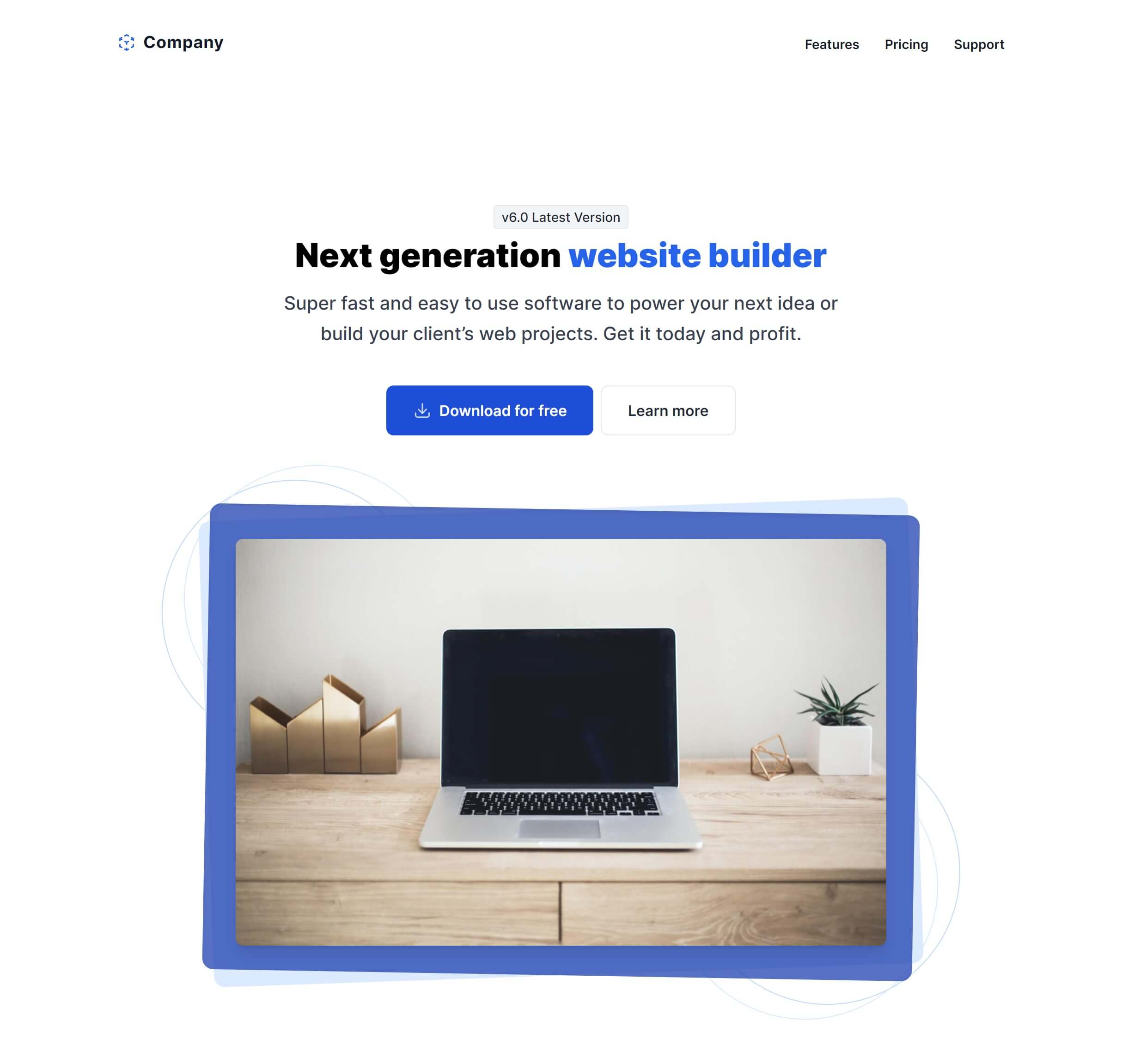
Tailwind CSS Hero
There are 26 available components in this category, preview them all!
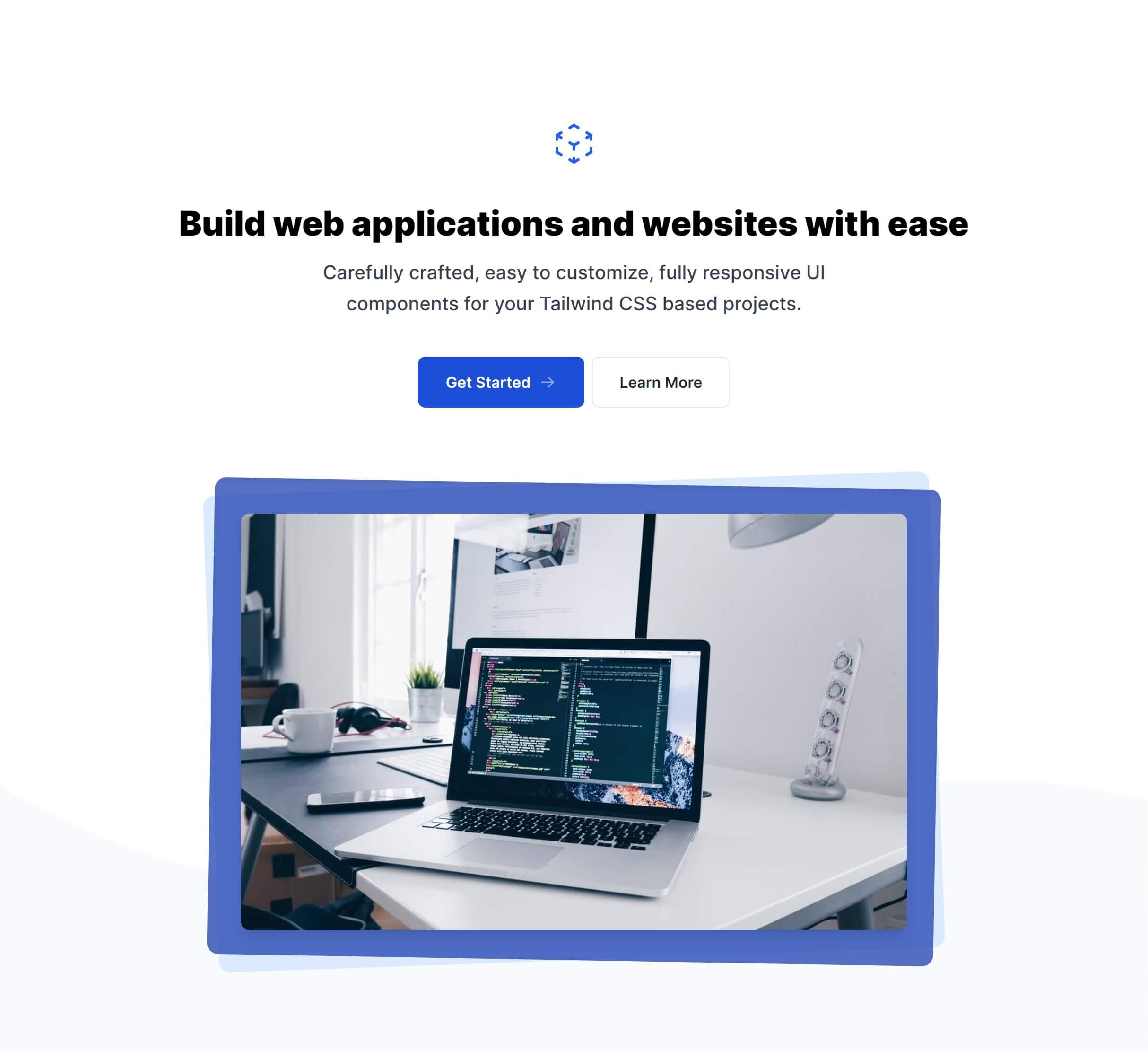
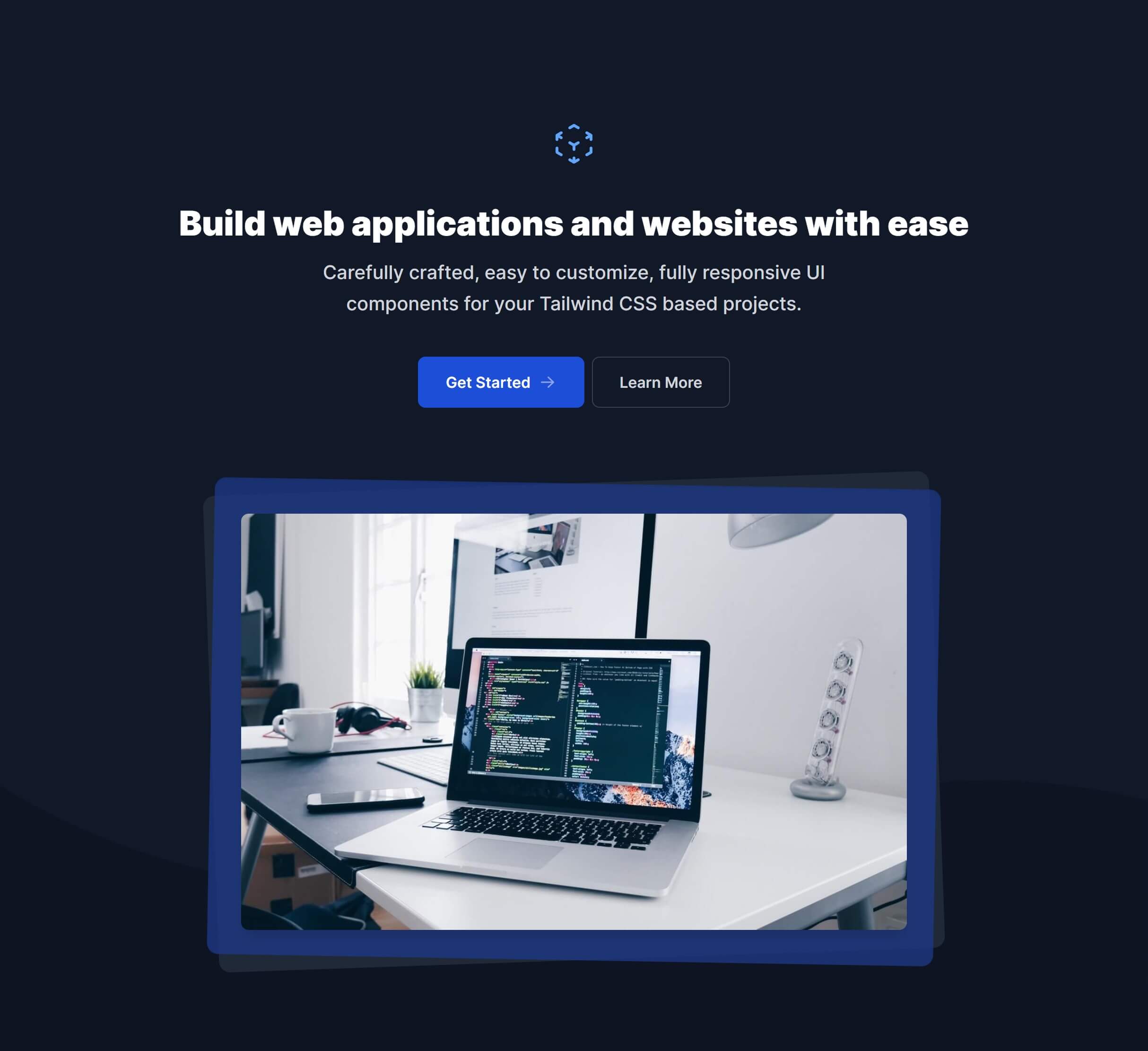
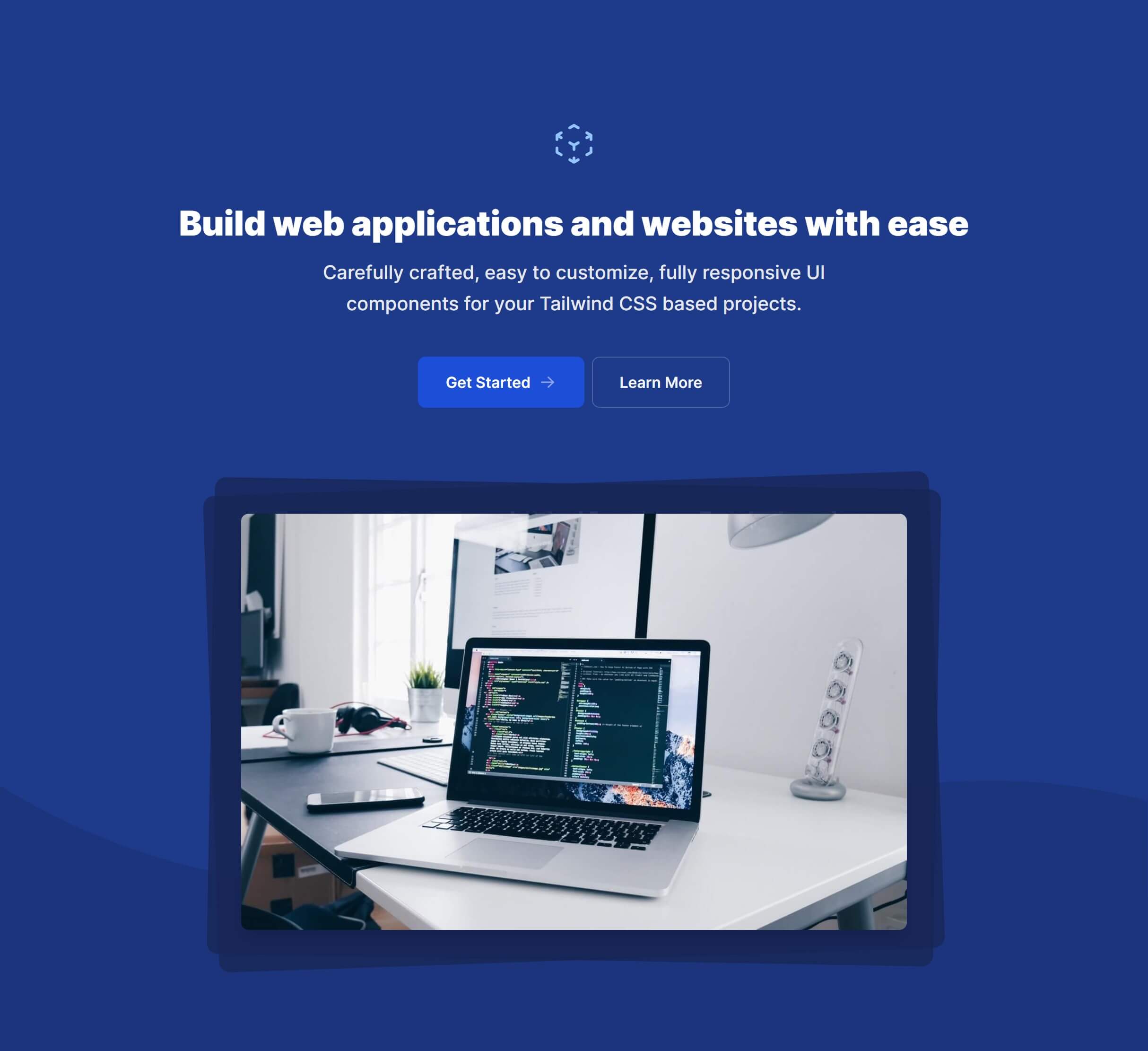
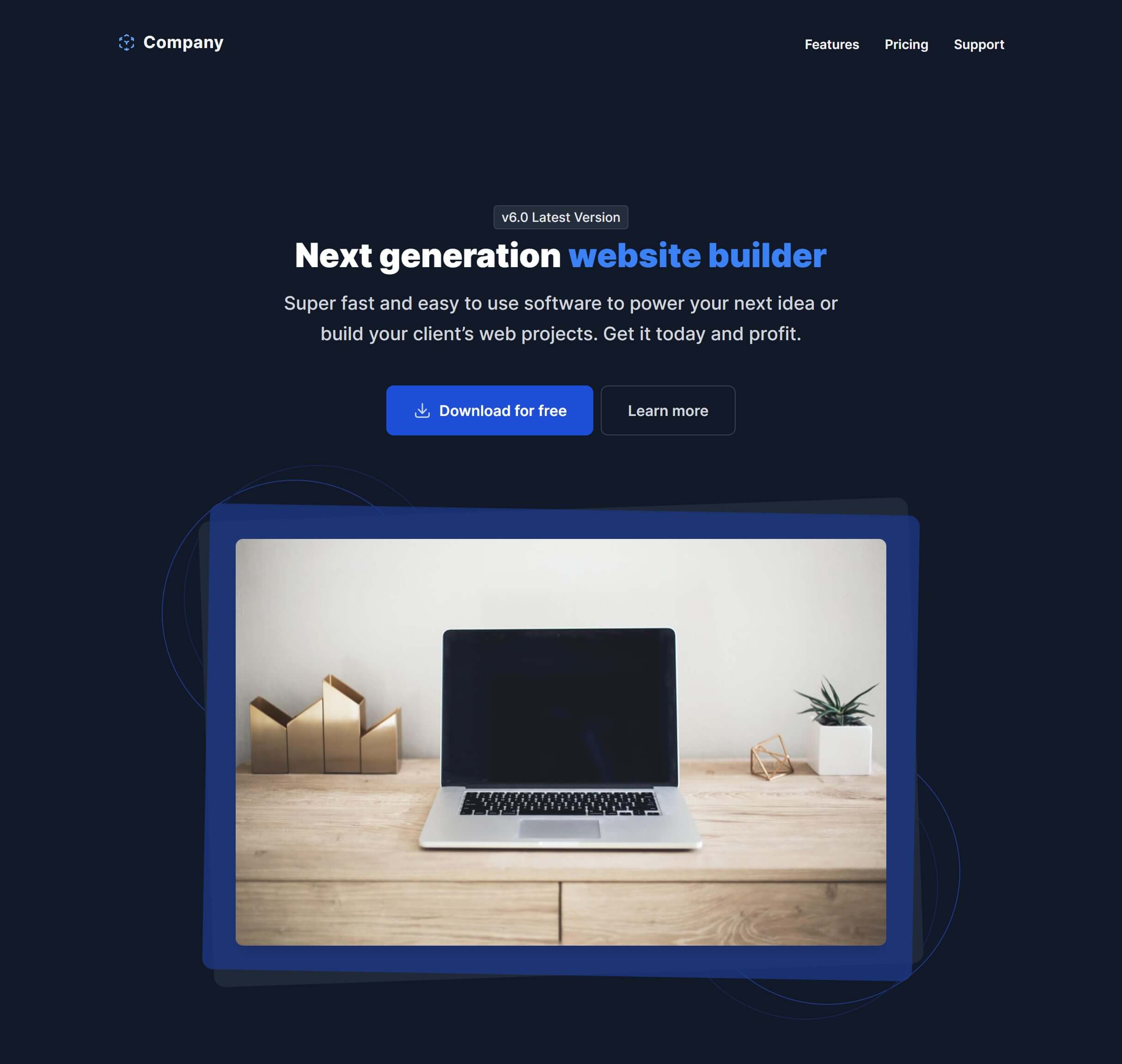
Gradient Box and Lines

Centered with Social Proof

Centered with Social Proof and Lines
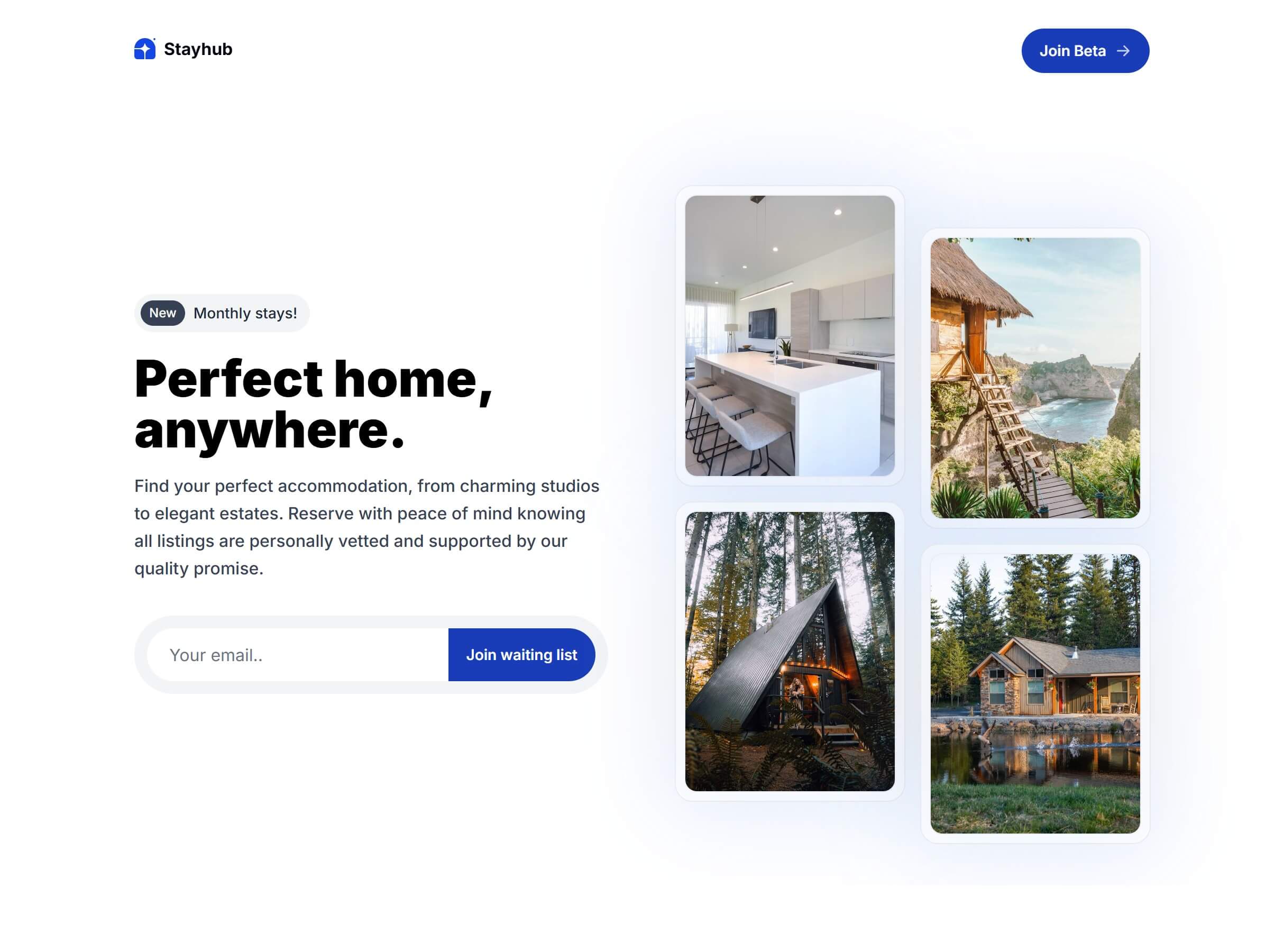
Multiple Images with Email Form

Multiple Images Alt with Email Form
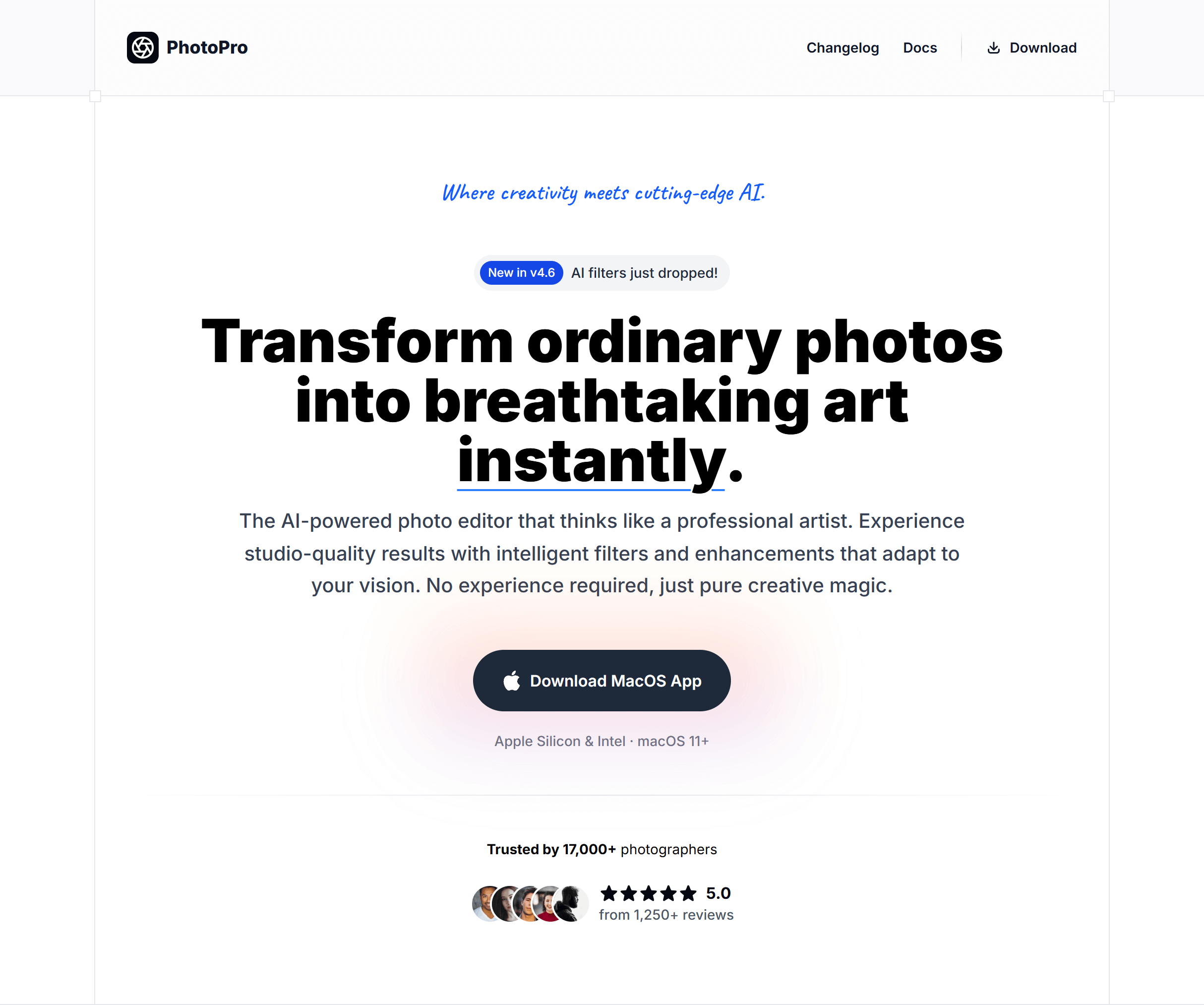
Centered with Image Glass
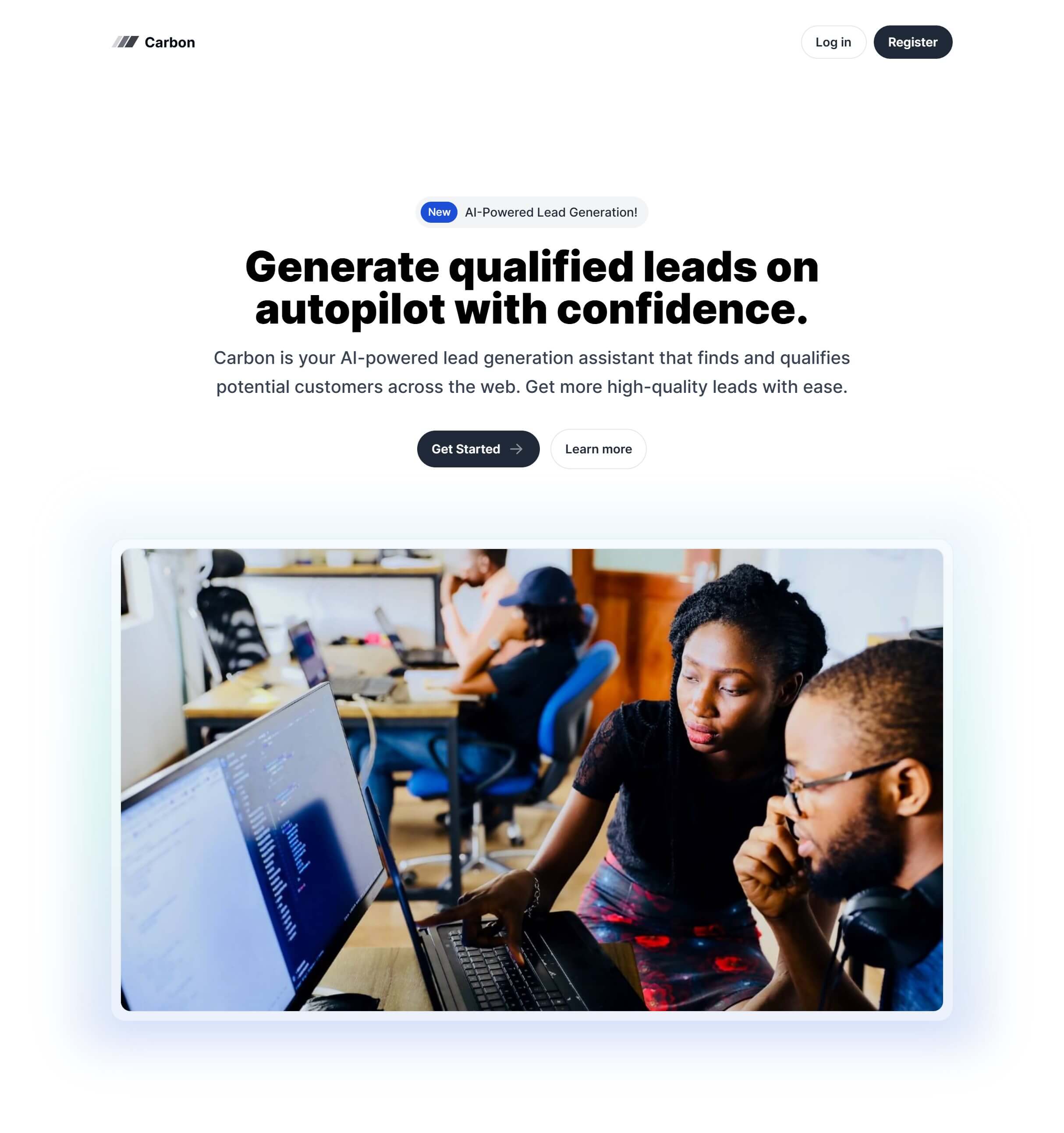
Image Side with Gradient

Multiple Images with Gradient

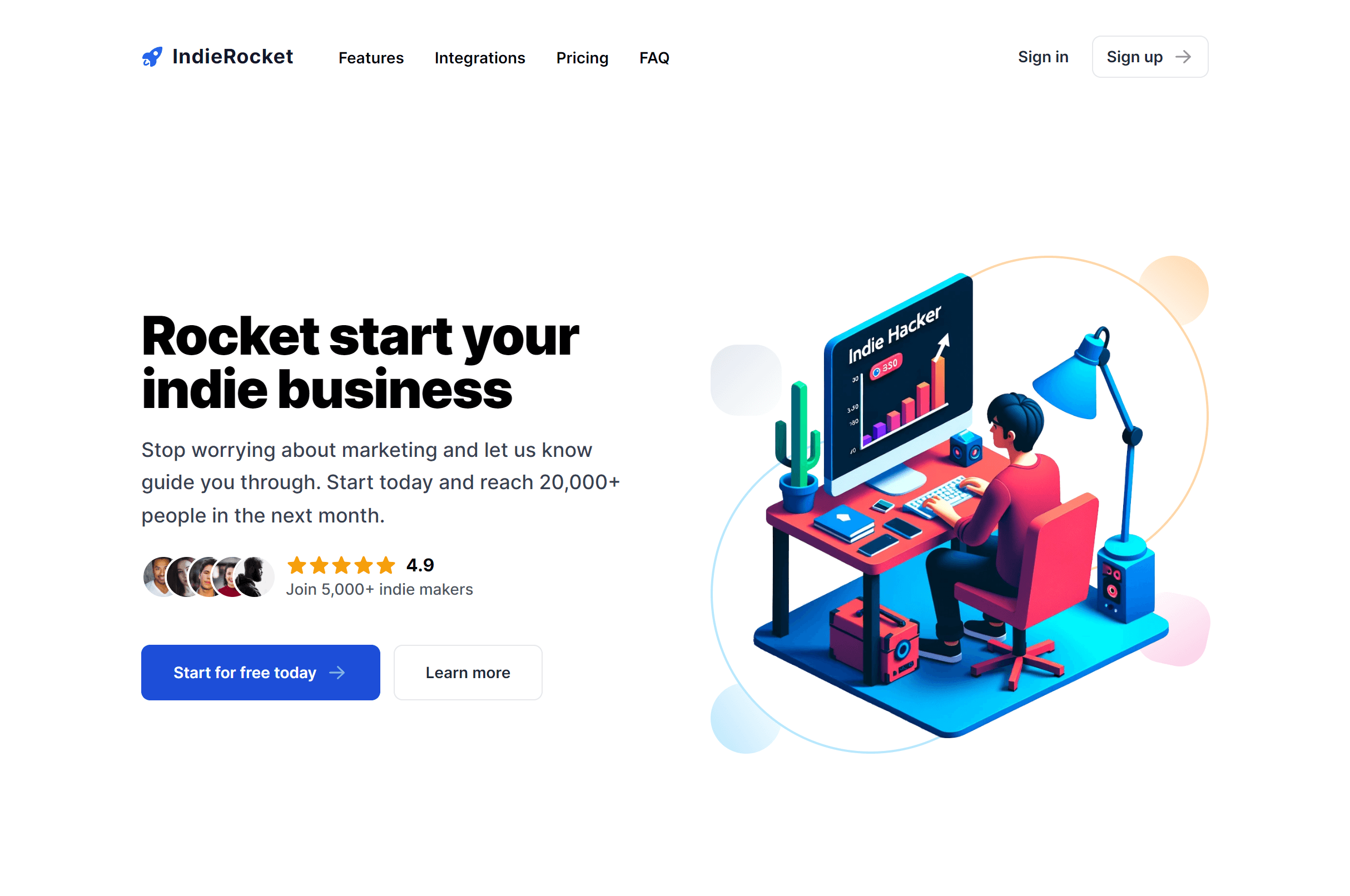
Image Side With Social Proof
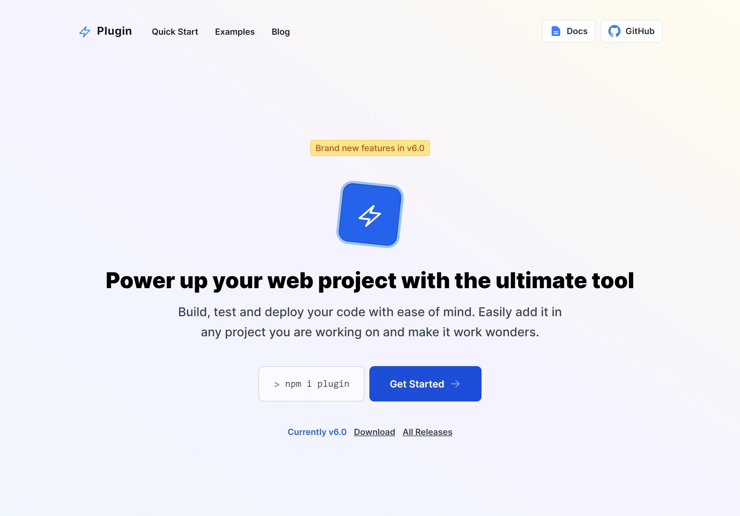
Subtle Gradient Box
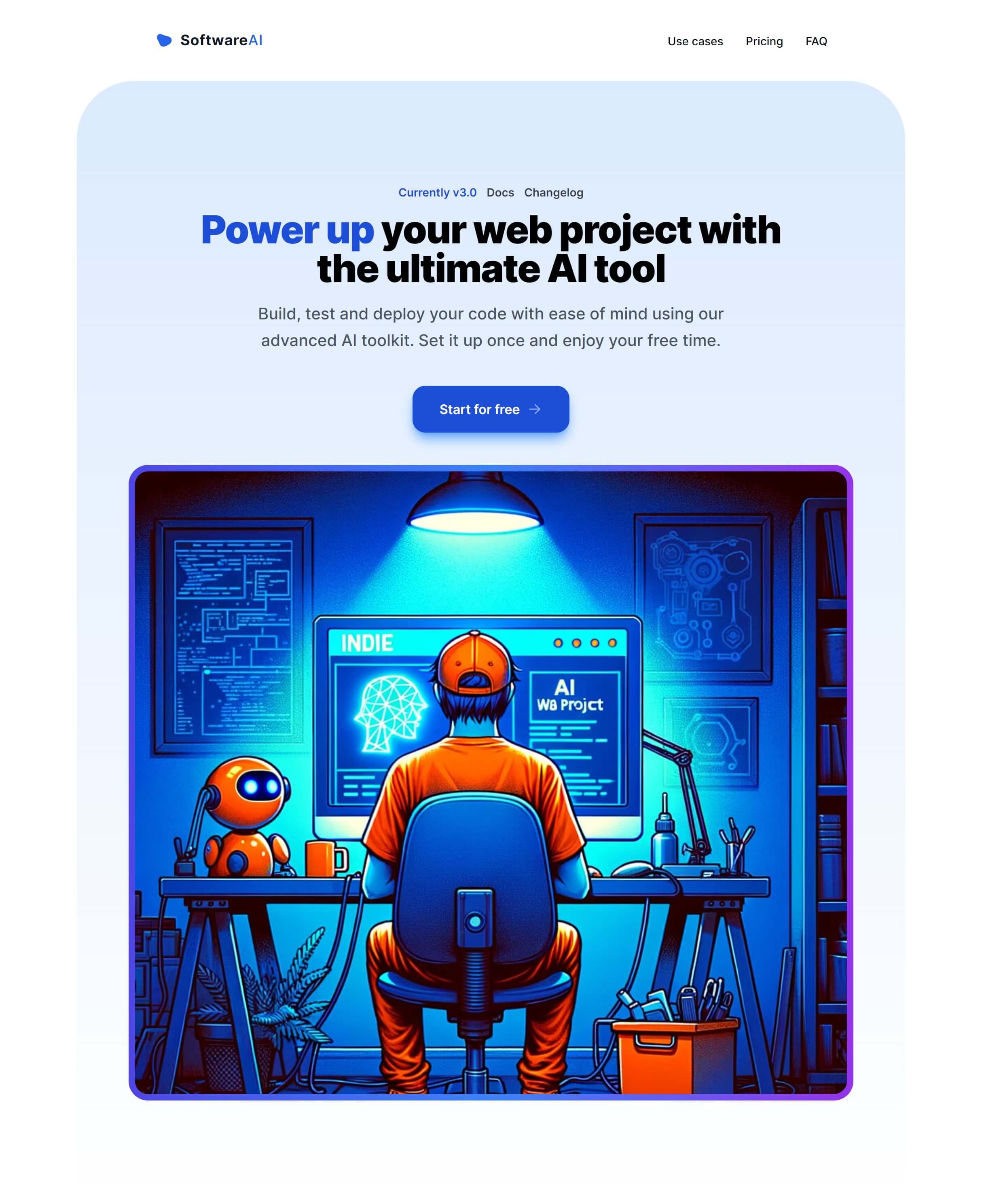
Image Side with Email Form

Subtle Gradient with Header Links
Colorful Top Gradient with Header Links

Image Side with Header Actions

Image Side with Simple Header
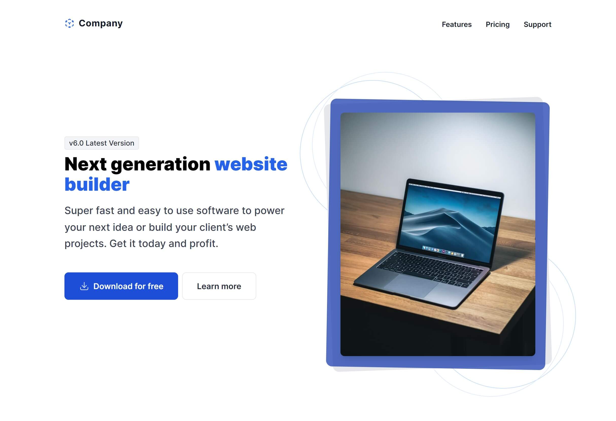
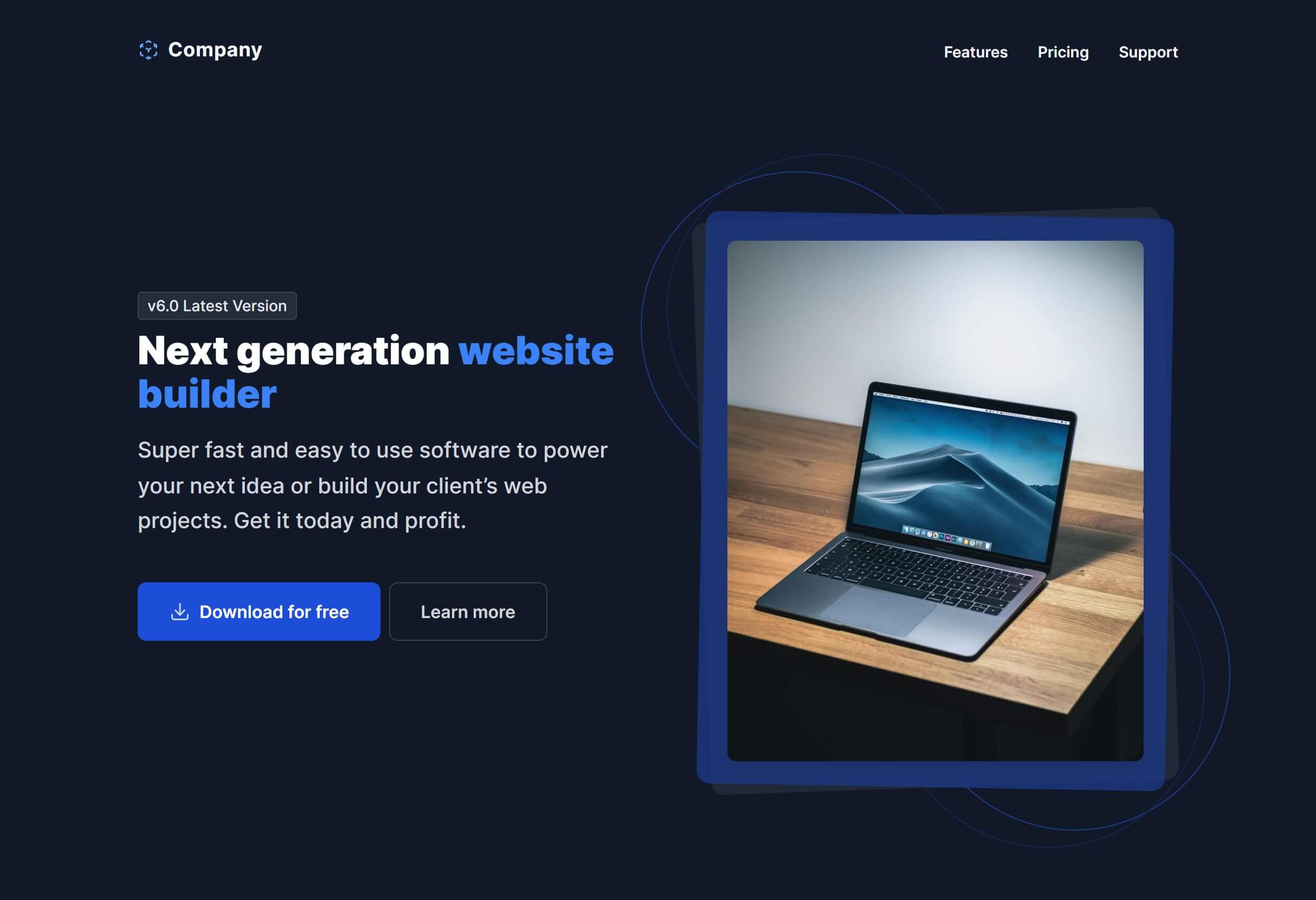
Image Side with Simple Header Dark
Simple with Logo
Simple with Logo Dark
Simple with Logo Brand
Centered with Simple Header
Centered with Simple Header Dark
Centered with Simple Header Brand
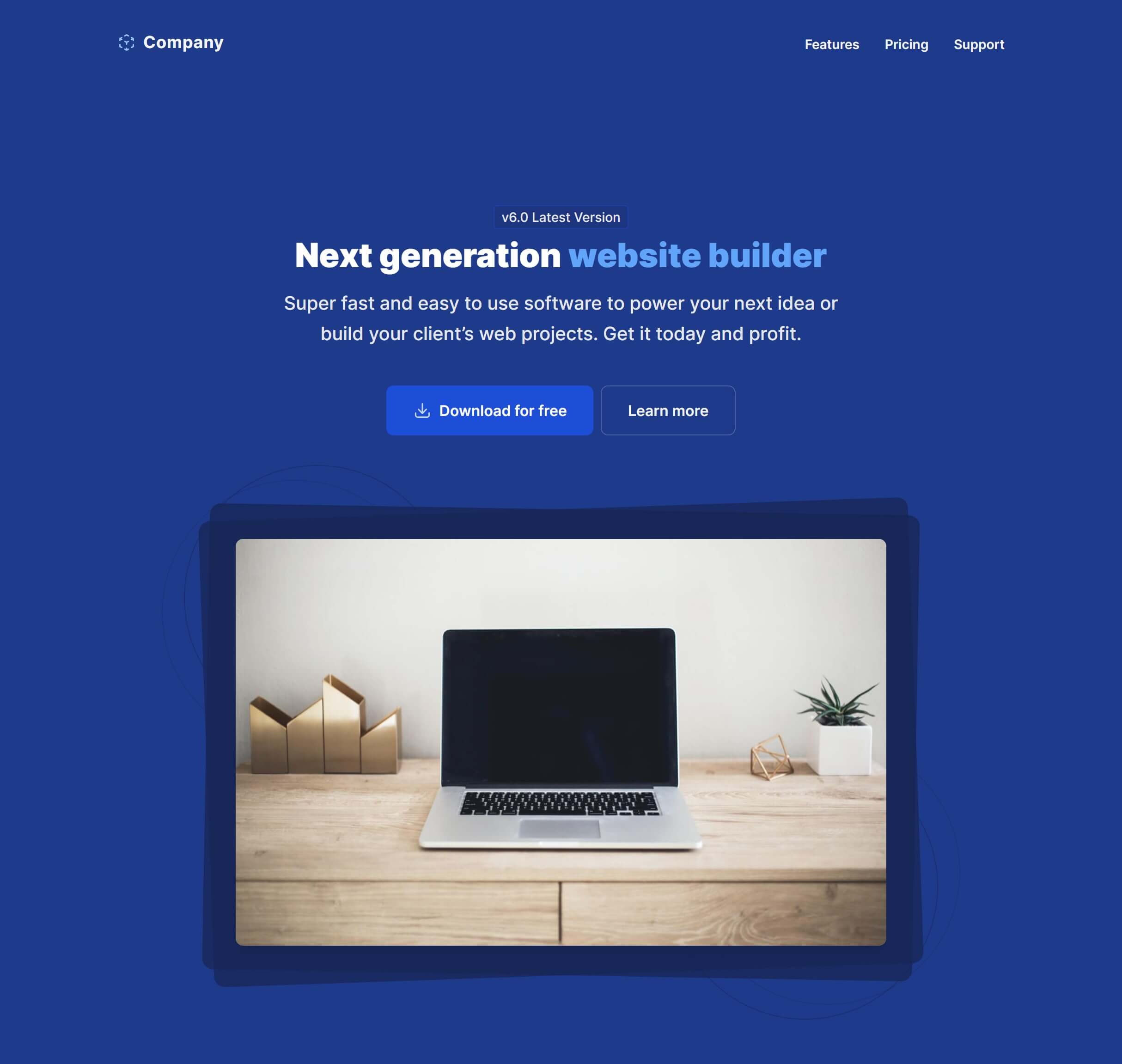
Image Cover with Header Actions

Image Cover with Header Actions Dark

Image Cover with Header Actions Brand

Promo Box with Header Actions

Frequently Asked Questions
Let’s have a better look into Tailwind CSS Hero.
How do I optimize hero images for performance?
Serve images in WebP format for smaller file sizes. Use the srcset attribute or <picture> element to deliver different sizes at different breakpoints so mobile users don't download desktop-sized images. Lazy loading isn't appropriate for hero images since they're above the fold. Instead, consider using fetchpriority="high" to tell browsers to prioritize the hero image.
What makes a good hero headline?
Focus on the outcome your product delivers, not what it is. "Ship features faster with less code" beats "A modern development platform." Keep it under 10 words if possible. Support the headline with a one-sentence subheading that adds specificity, like who it's for or what makes it different. The CTA button should clearly state the next step: "Start free trial," "See it in action," or "Get started."
How do I make the hero section full-viewport height?
Add min-h-dvh to the hero container. Most variants use flexible height that adapts to content, but making them viewport-height is a single utility class change. On shorter viewports, ensure the content doesn't overflow by testing on common screen sizes.
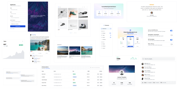
2,000+ handcrafted snippets.
Now in your AI editor.
Build modern web apps and websites with Tailkit's huge collection of Tailwind components, templates and tools. Now available through our MCP Server.