Tailwind CSS Form Radio Groups
There are 14 available components in this category, preview them all!
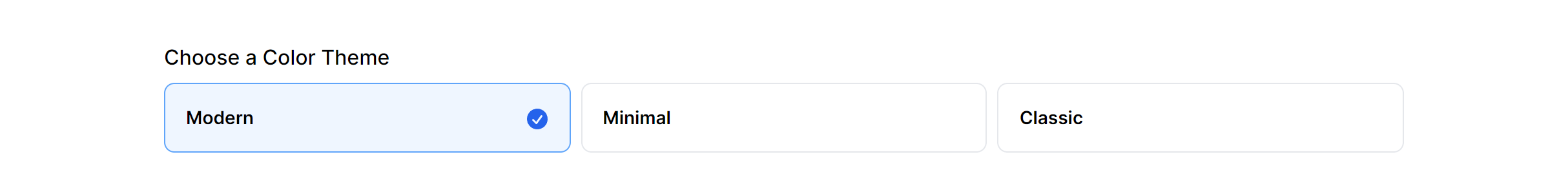
Horizontal
Stacked

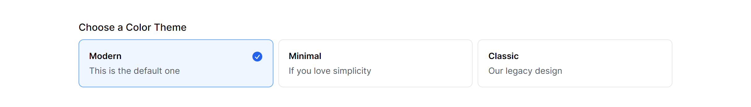
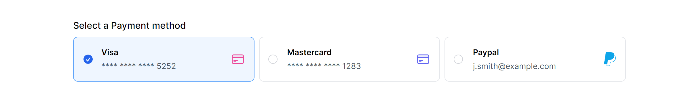
Horizontal with Details
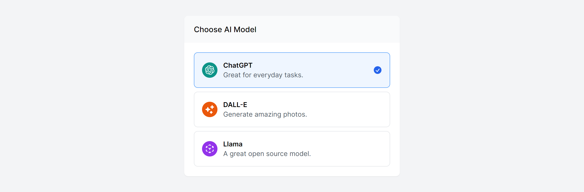
Stacked with Details

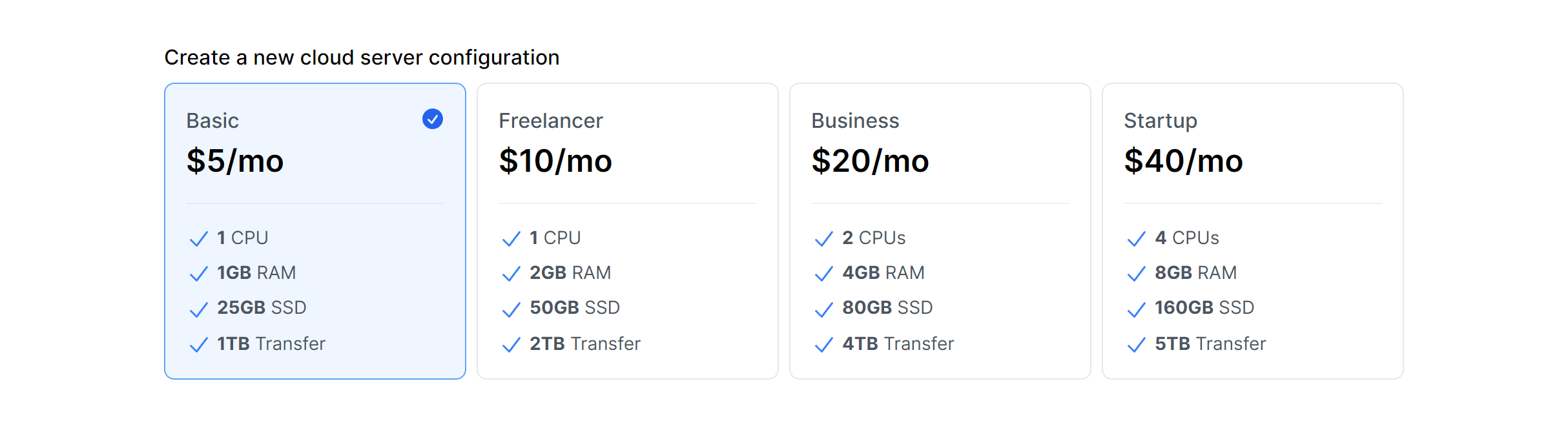
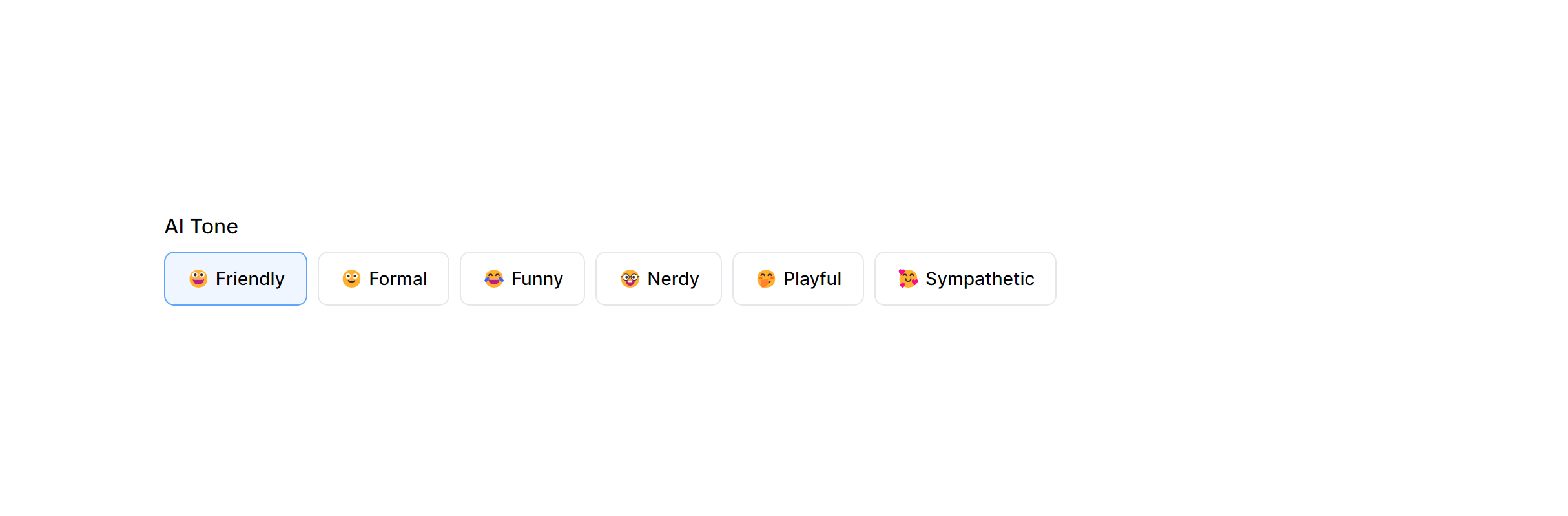
Horizontal with Features
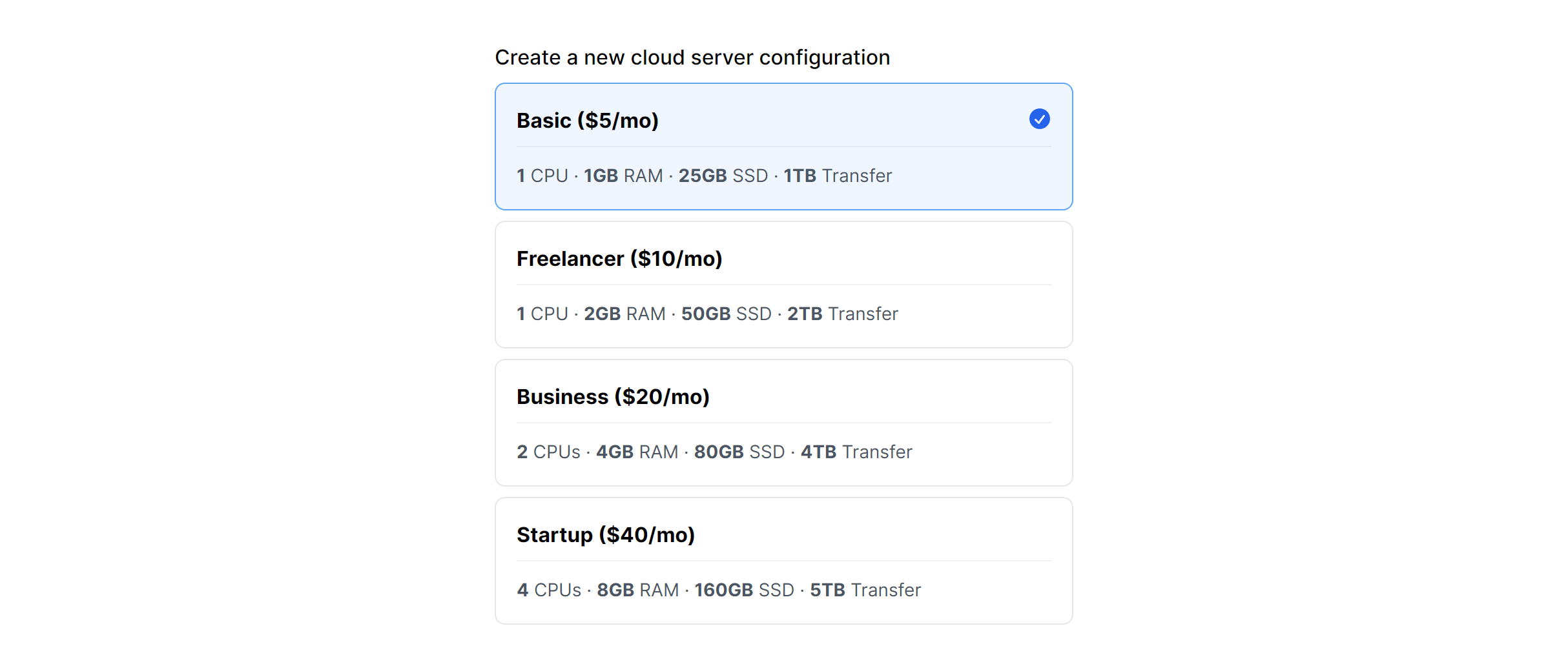
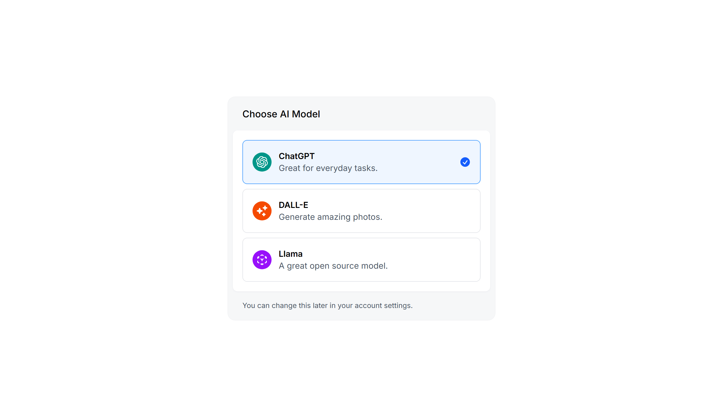
Stacked with Features
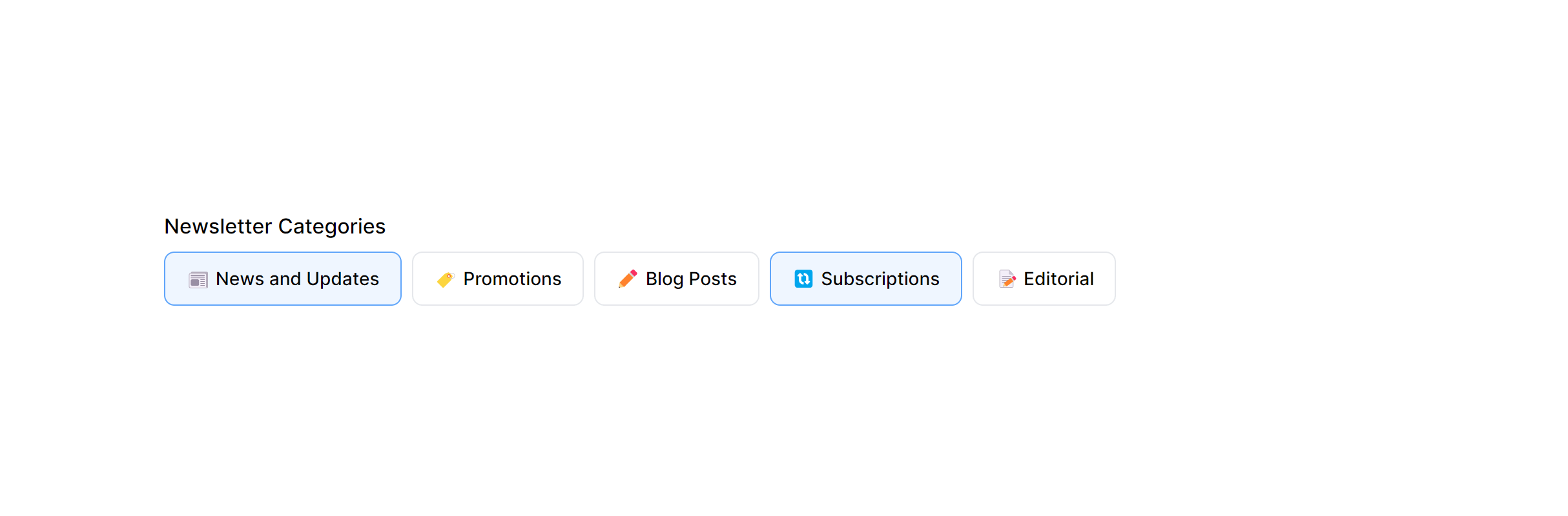
Horizontal with Icons
Stacked with Icons
Horizontal Alternate
Stacked Alternate

Simple Horizontal
Simple Horizontal Multiple
Stacked with Details in Card
Stacked with Details in Card Alternate
Frequently Asked Questions
Let’s have a better look into Tailwind CSS Form Radio Groups.
How do card-style Tailwind CSS radio groups work under the hood?
They use standard <input type="radio"> elements, typically hidden with appearance-none opacity-0, paired with <label> elements styled as cards. The peer modifier in Tailwind lets you change the card's appearance based on the radio's checked state. Clicking anywhere on the card selects the option because the entire card is a label. Native form submission and validation work without any JavaScript.
When should I use radio buttons vs. a select dropdown?
Radio buttons work best when you have 2 to 5 clearly distinct options and enough screen space to show them all. Users can compare options at a glance without any interaction. Select dropdowns are better for longer lists (countries, categories) or when screen space is limited. If the choice has significant implications (like a pricing plan), always use radio buttons or cards so all options are visible.

2,000+ handcrafted snippets.
Now in your AI editor.
Build modern web apps and websites with Tailkit's huge collection of Tailwind components, templates and tools. Now available through our MCP Server.