Tailwind CSS Light Sidebar
There are 6 available components in this category, preview them all!
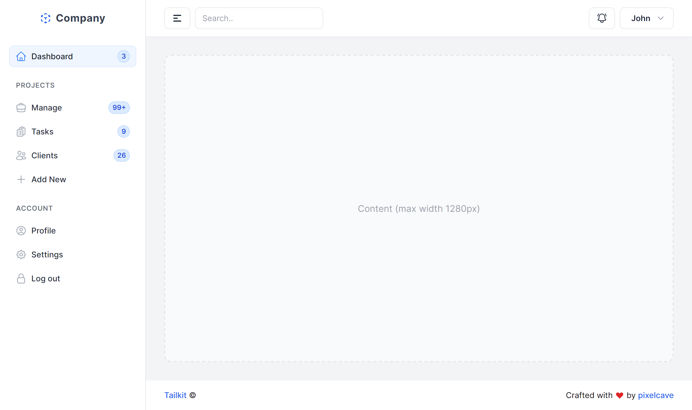
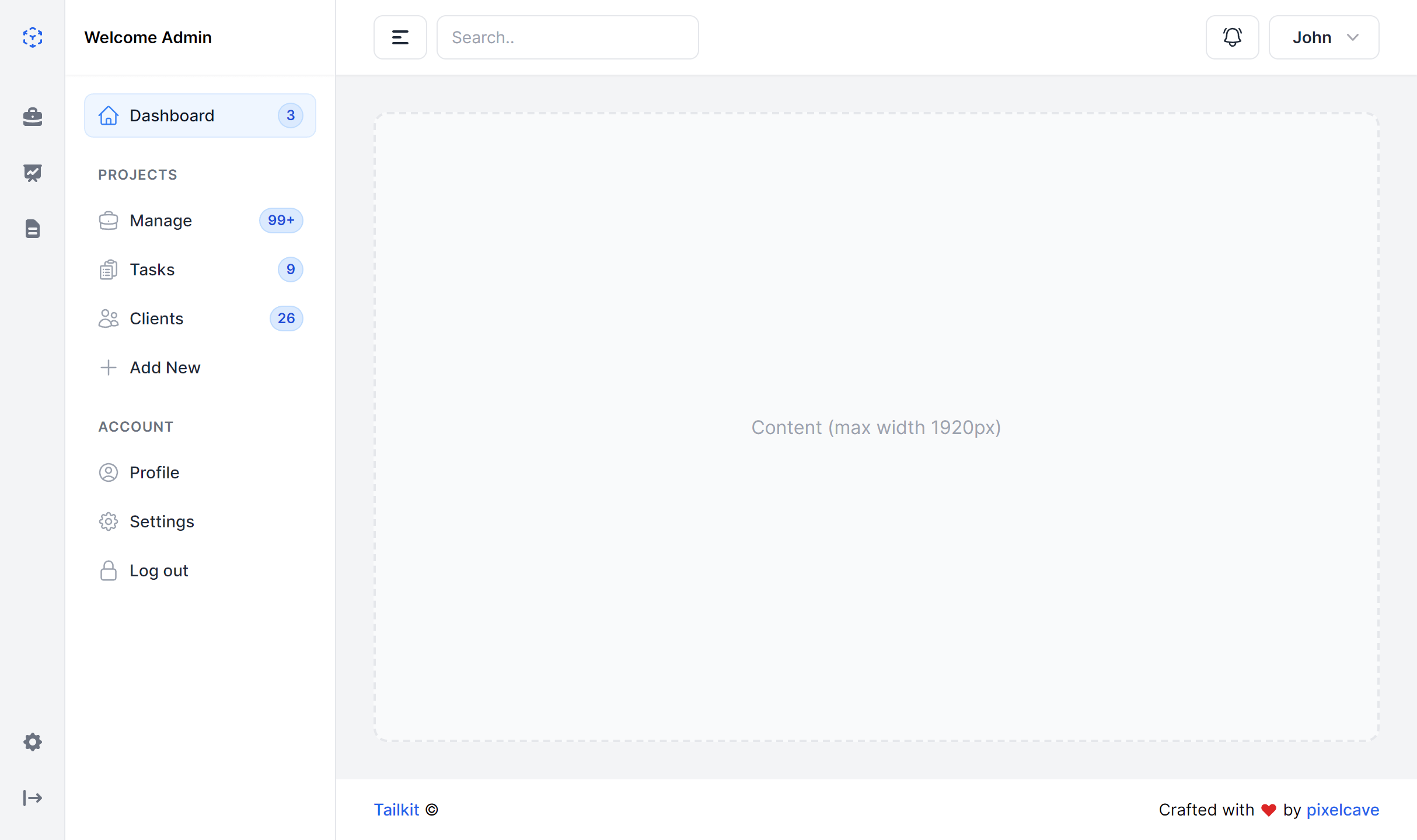
Full Content

Boxed Content
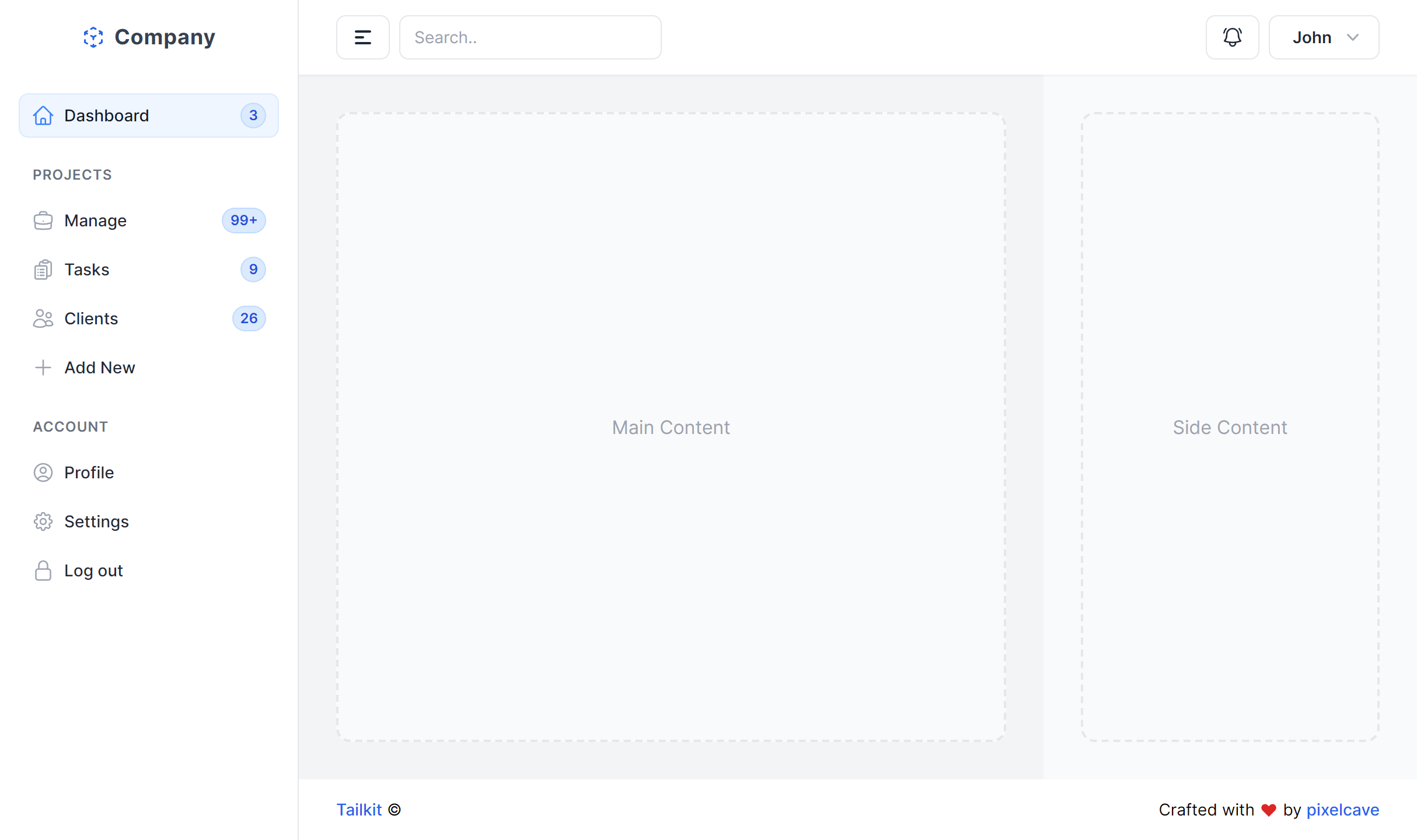
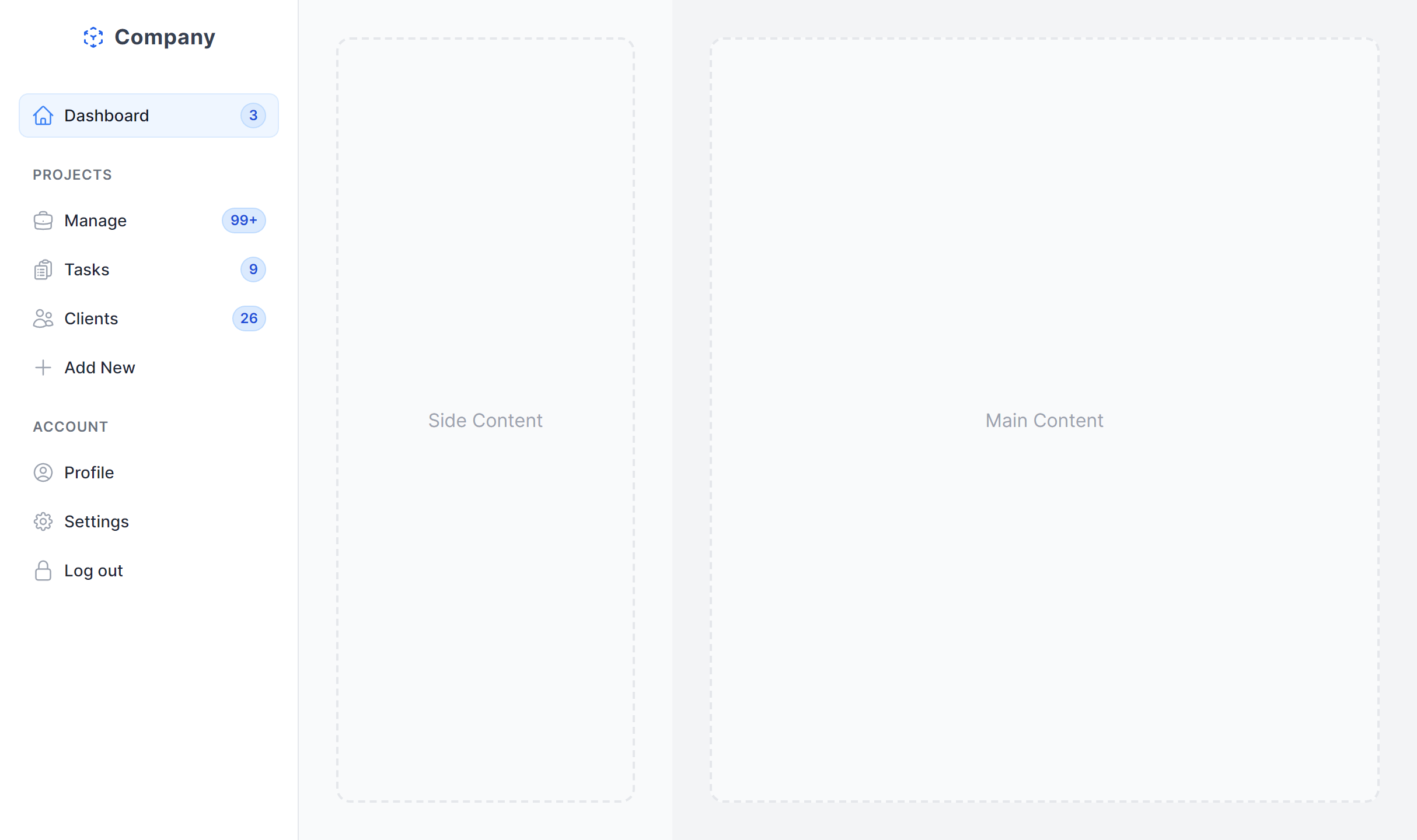
With Side Content Left
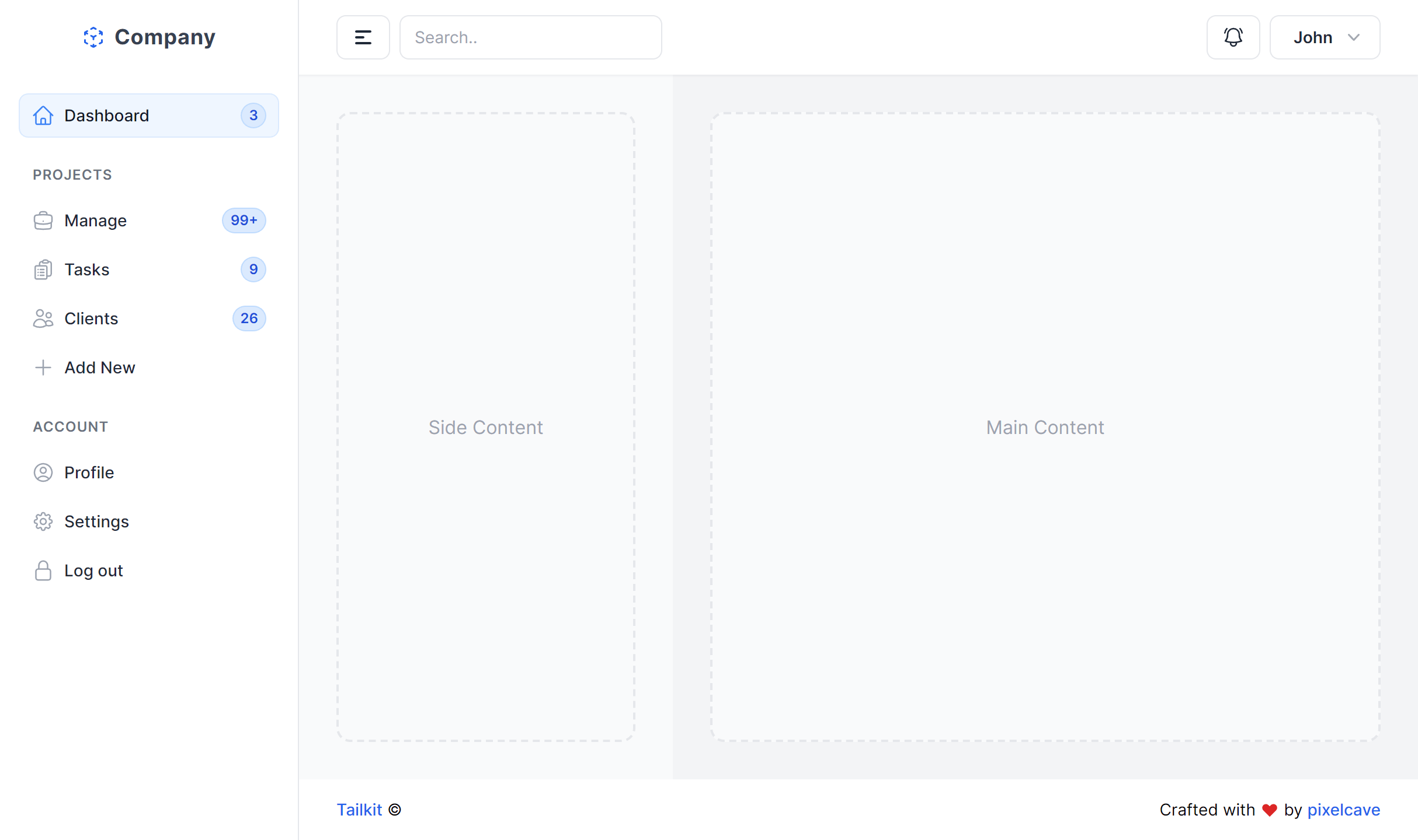
With Side Content Right
Multi Column
With Mini Sidebar
Frequently Asked Questions
Let’s have a better look into Tailwind CSS Light Sidebar.
How do I persist the collapsed/expanded sidebar state?
Toggle the sidebar width and label visibility with a button click, then store the user's preference in localStorage. On page load, read the stored value and apply the matching state before the first render. This prevents a visual flash between states. The collapsed mode shows icons only, and the expanded mode reveals text labels alongside them.
How do I add branding to the sidebar?
Place your logo or app name at the top of the sidebar above the navigation items. Most variants include a designated logo area in the markup. Keep it compact so it doesn't crowd the navigation, especially in the collapsed state where an icon-sized version of your logo works best.
Can I combine a sidebar with a top navigation bar?
Yes. Several variants include a top header bar alongside the sidebar. This is a common pattern where the header handles global actions like search, notifications, and the user profile menu, while the sidebar focuses on section-level navigation. The two complement each other without overlapping.
Should I use a dark sidebar or a light sidebar?
Dark sidebars create a firm visual boundary between navigation and content. They feel more "app-like" and work especially well for data-dense applications where the content area is already busy with charts, tables, and forms. Light sidebars feel more spacious and open. Choose based on how much visual separation you want and the overall aesthetic you're going for.
2,000+ handcrafted snippets.
Now in your AI editor.
Build modern web apps and websites with Tailkit's huge collection of Tailwind components, templates and tools. Now available through our MCP Server.