v5.0 launch sale - limited time offer!
Tailwind CSS Features
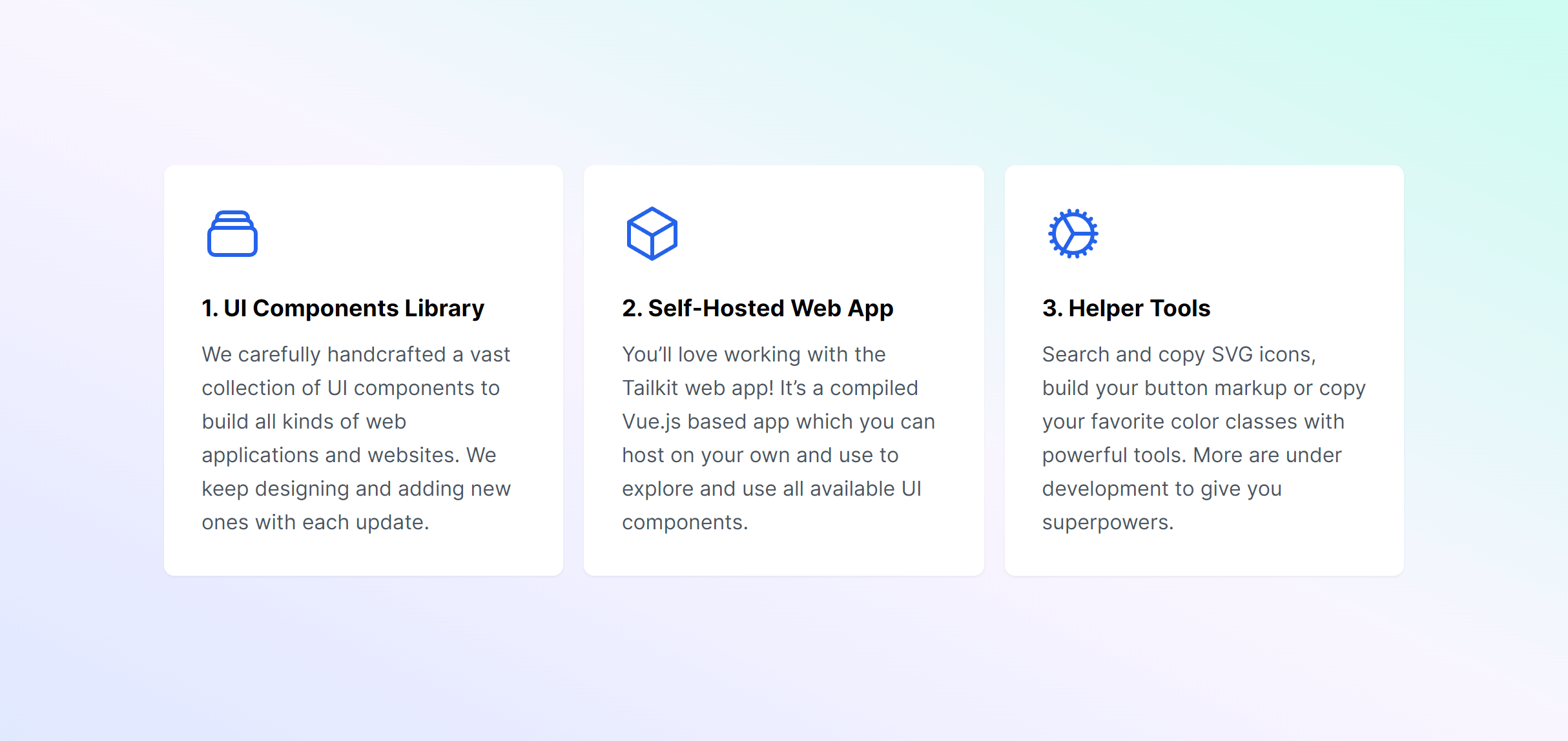
There are 25 available components in this category, preview them all!
Bento Grid
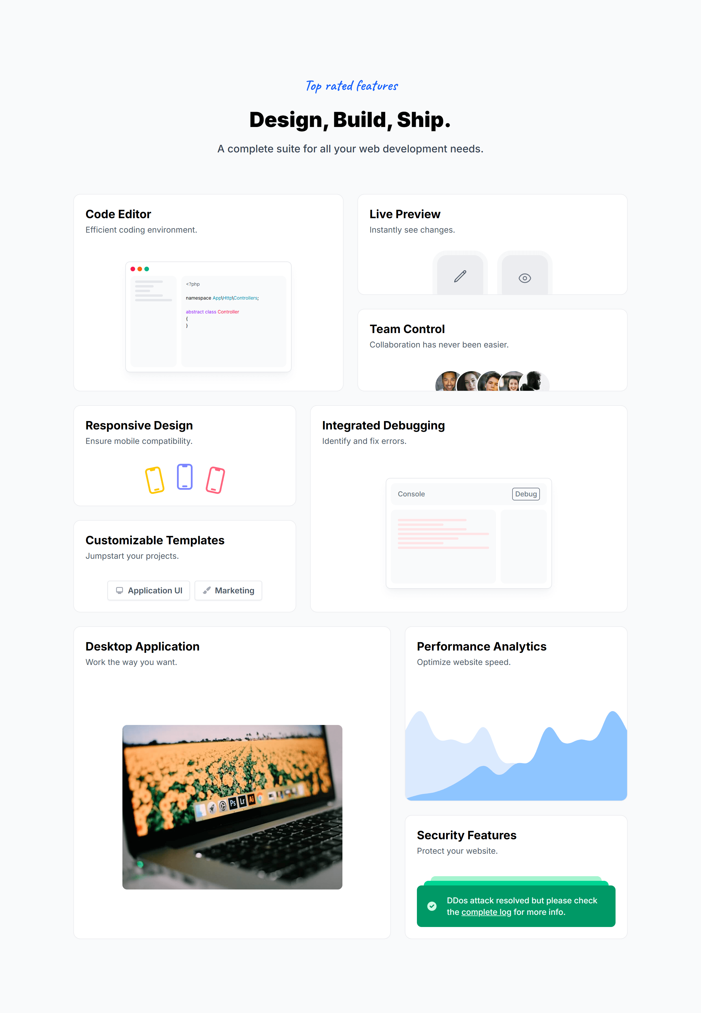
Bento Grid Alternate

Bento Grid Compact
With Animated Borders
With Animated Borders Alternate
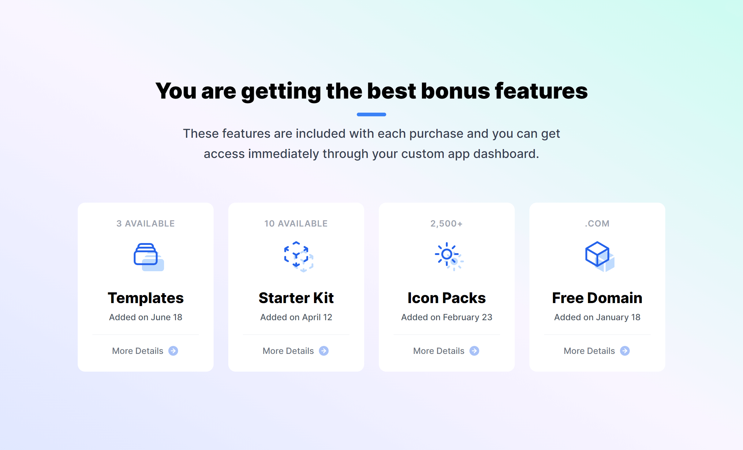
Boxes with Icons
Boxes with Icons Dark
Boxes with Icons Brand
Modern with Icons
Modern with Icons Left
Modern Alternate with Icons
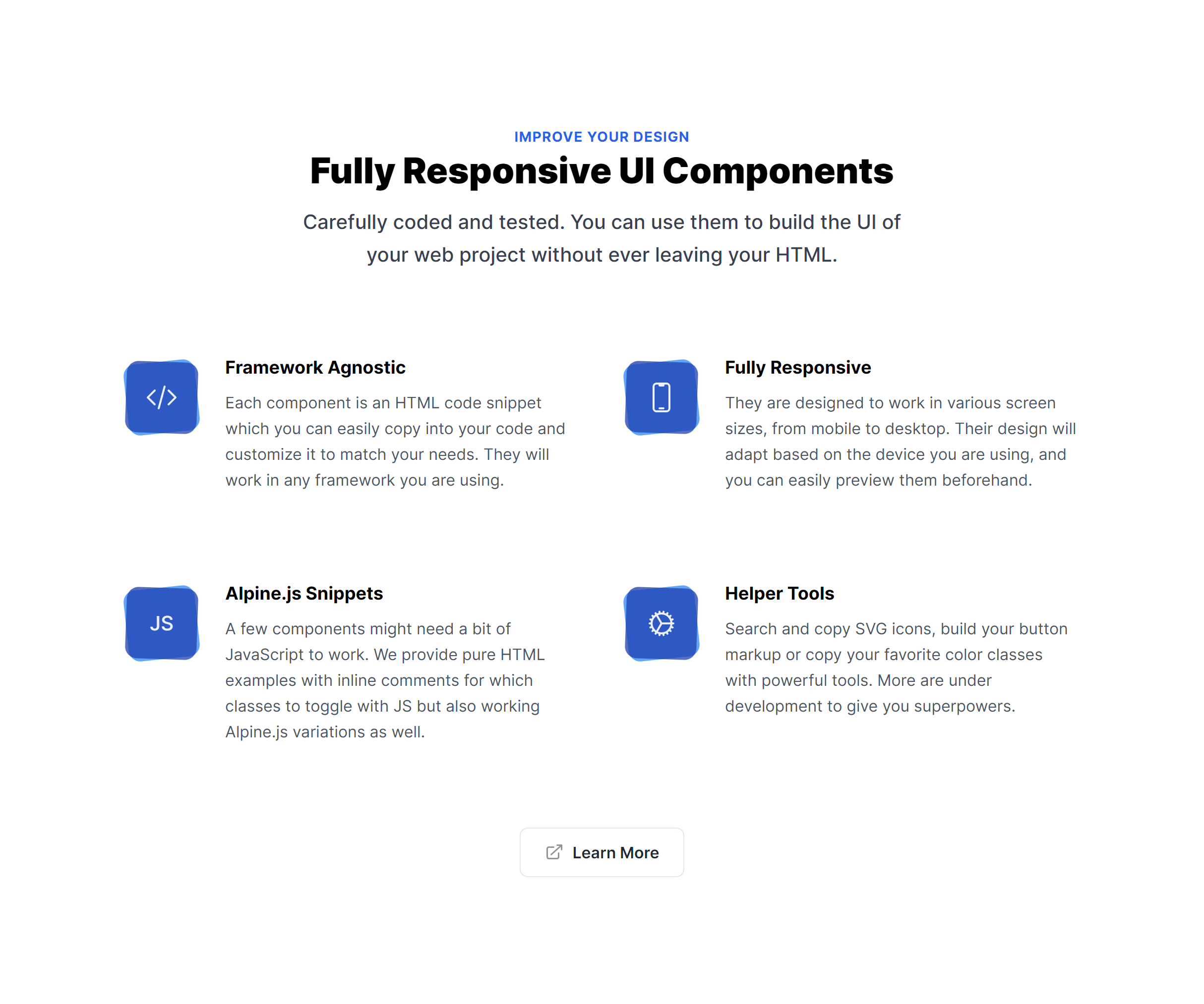
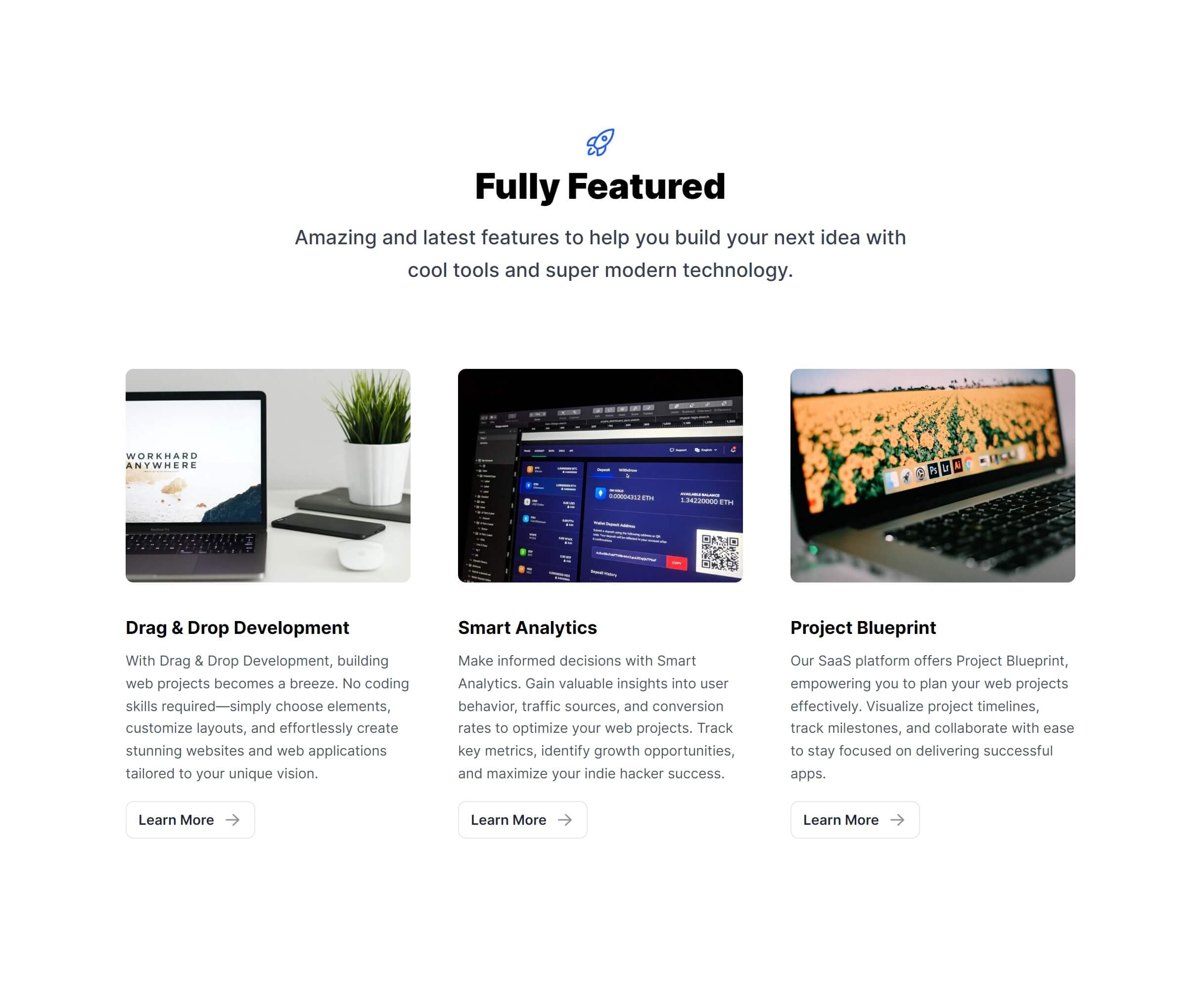
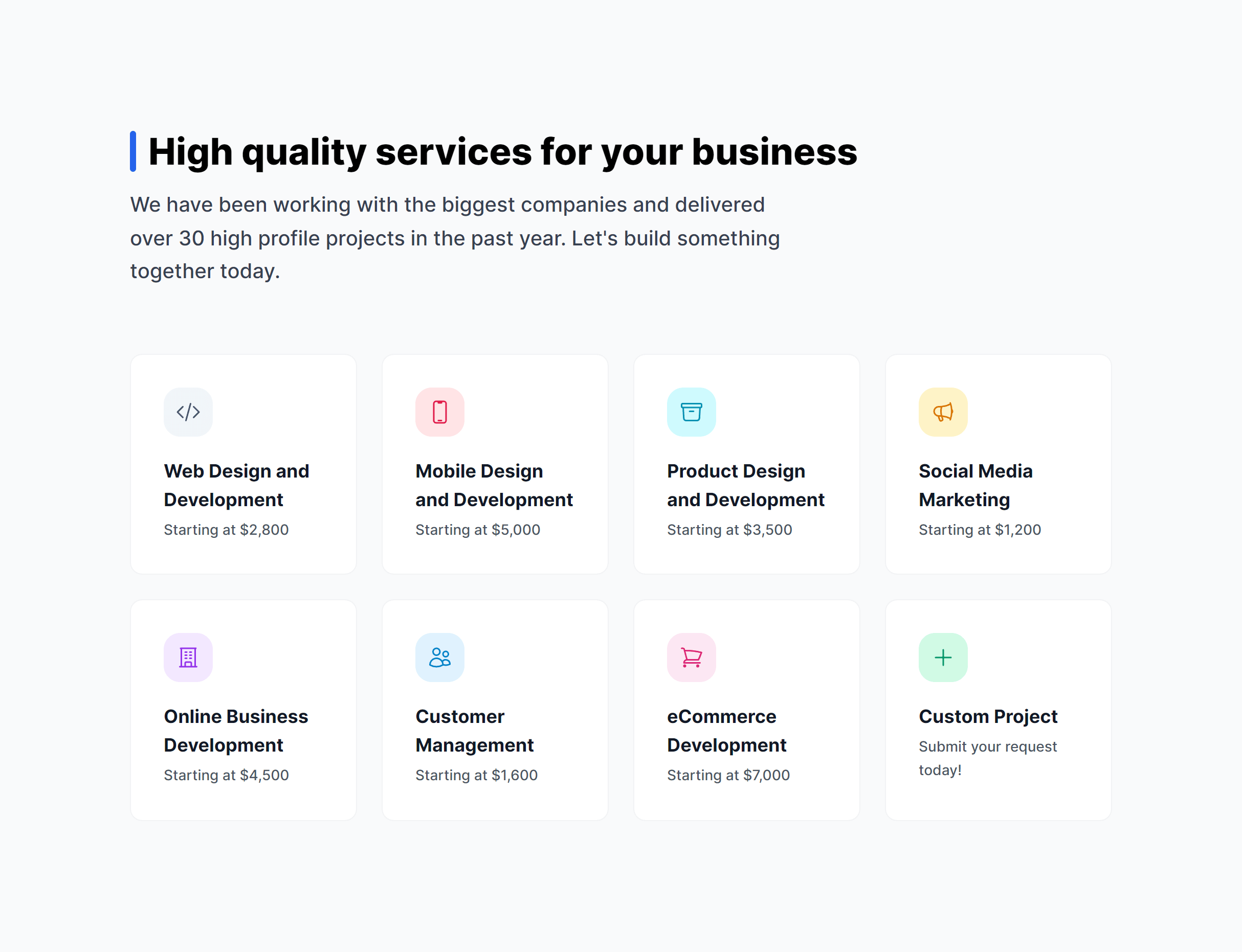
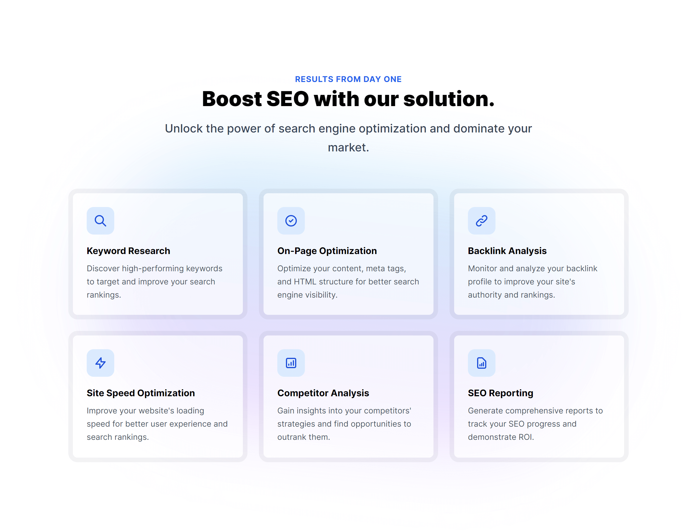
Key Features with Icons
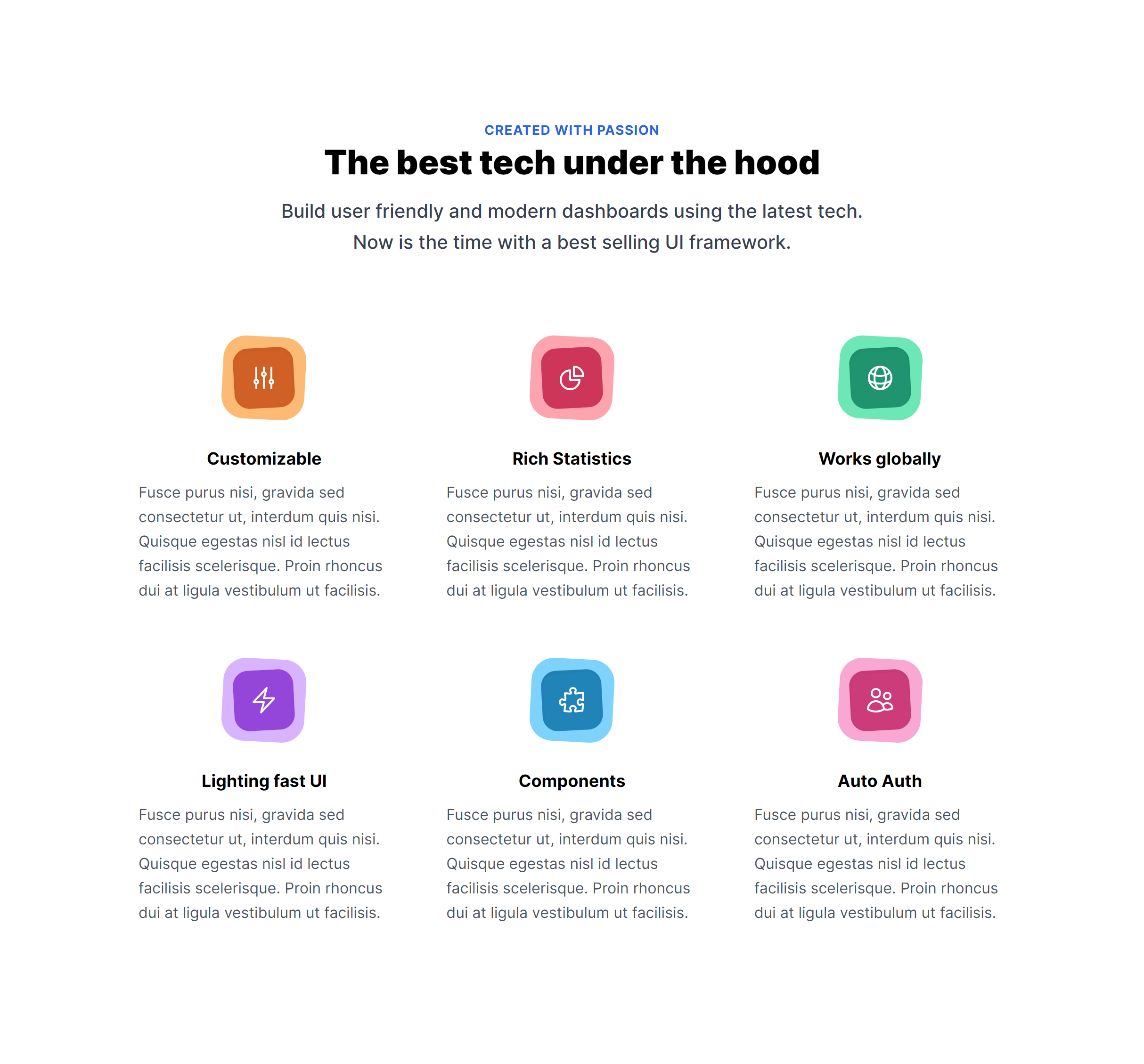
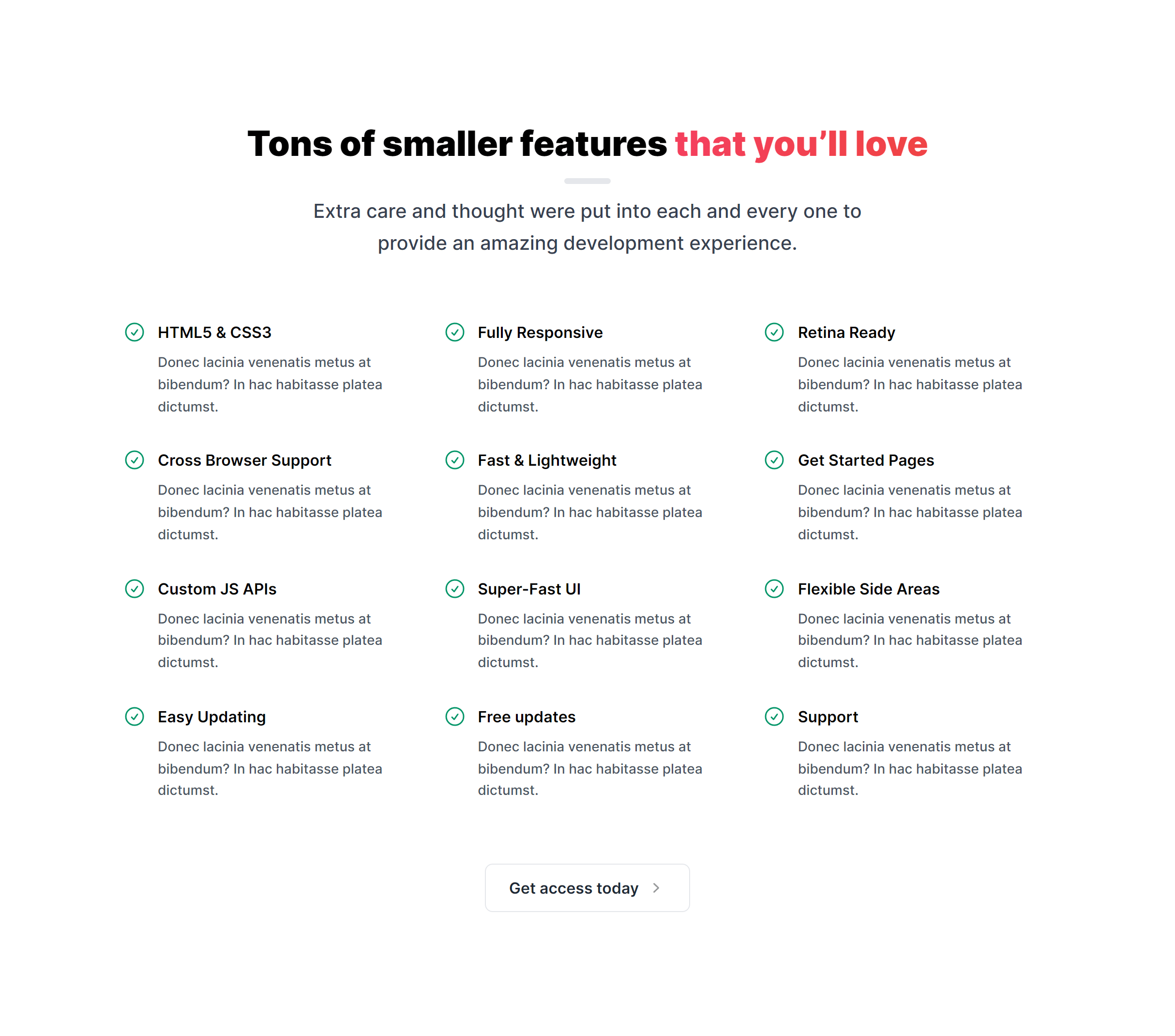
Key Features List
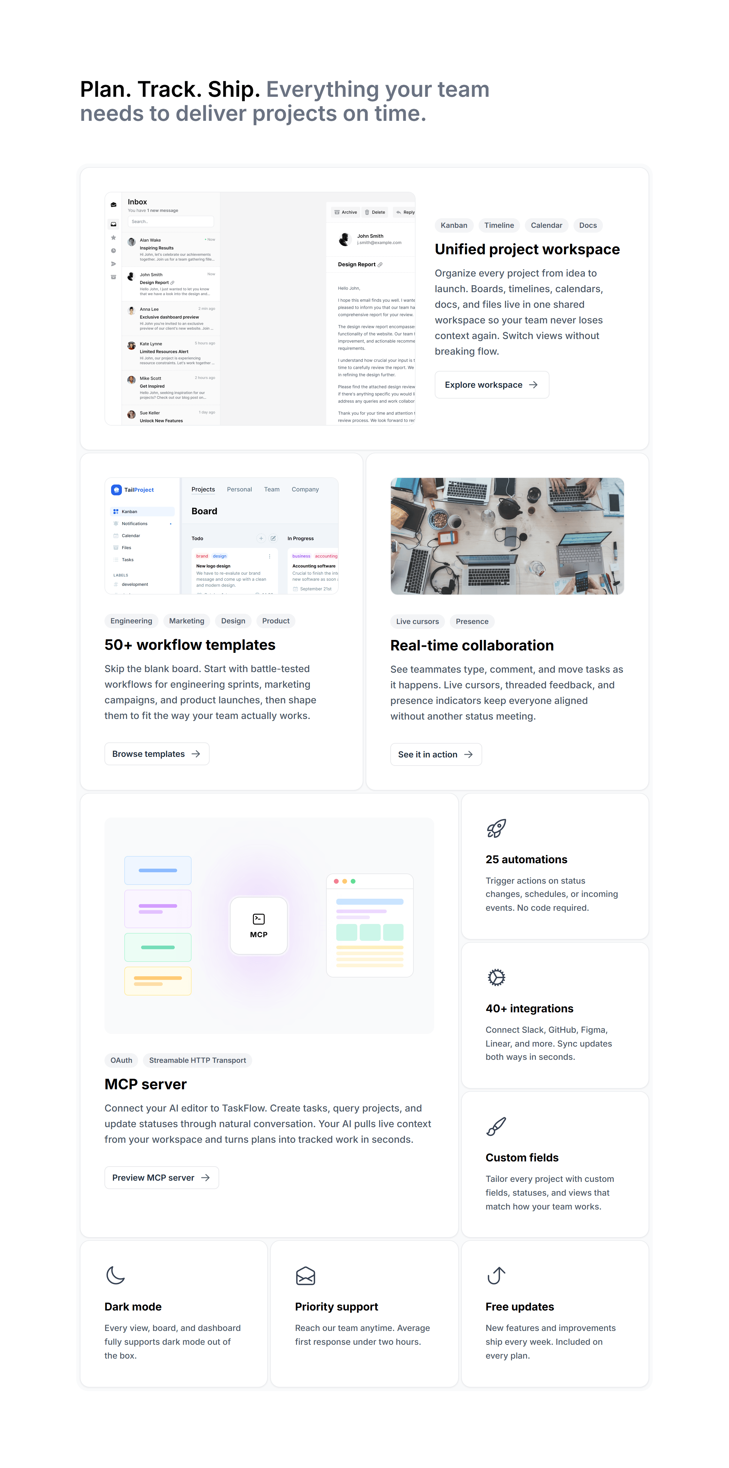
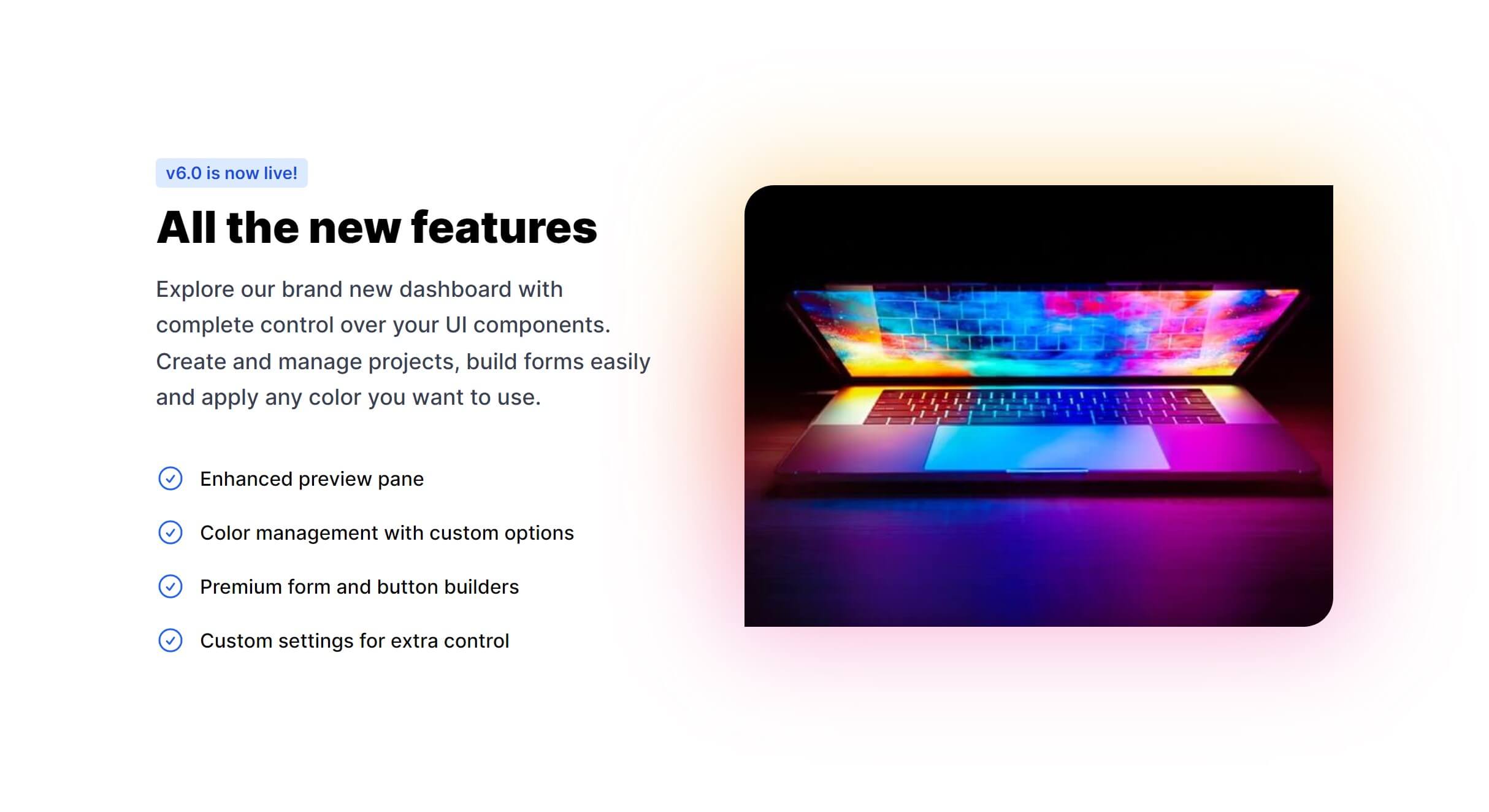
With Images
Featured Image
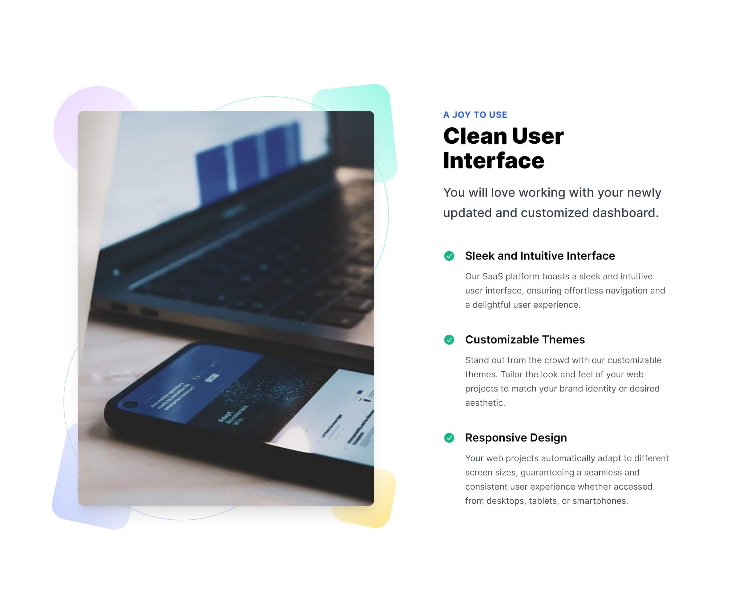
Featured Image Side
Vertical Cards
Card Links
Subtle Link Boxes
Subtle with Icons
Subtle Item Boxes
Featured Image Side Alternate
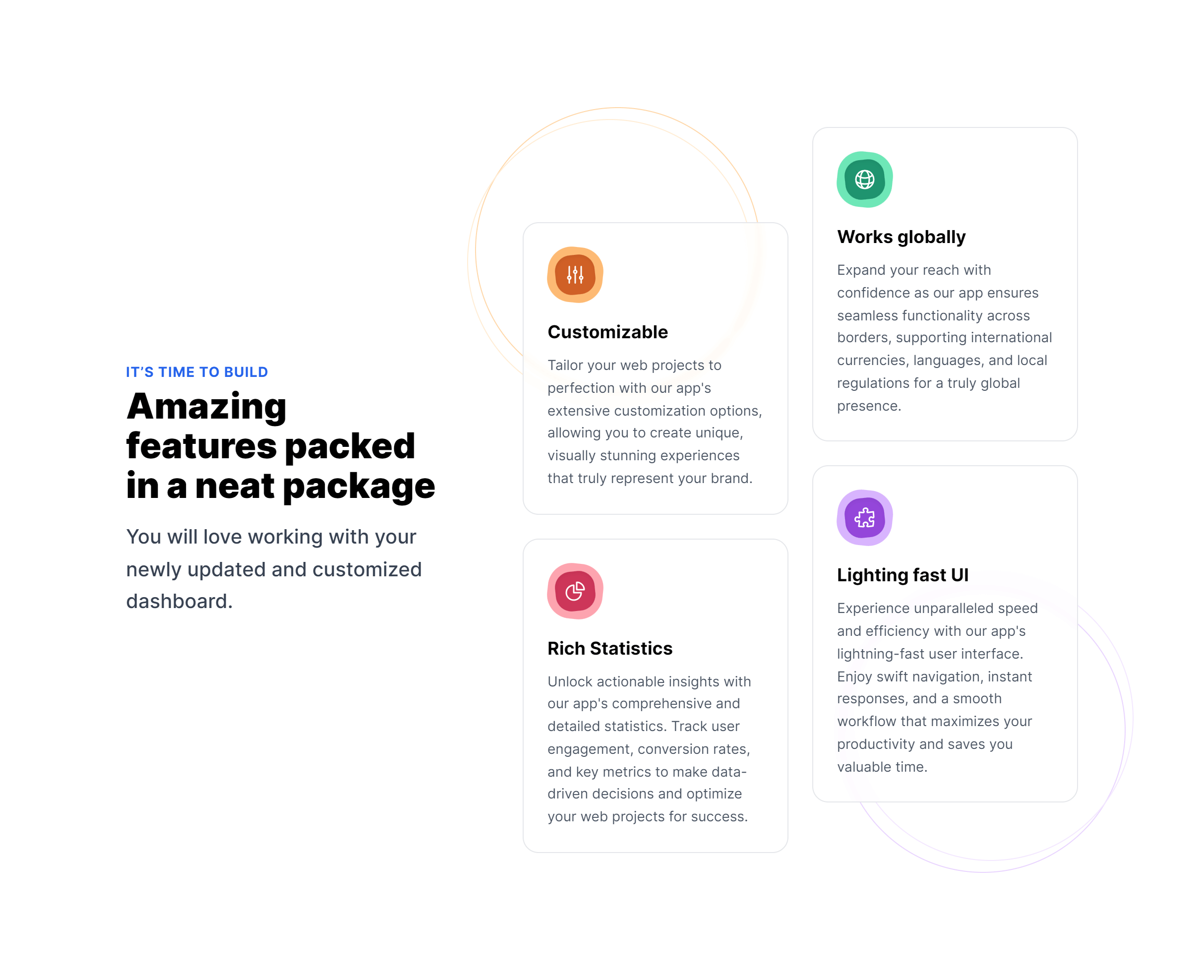
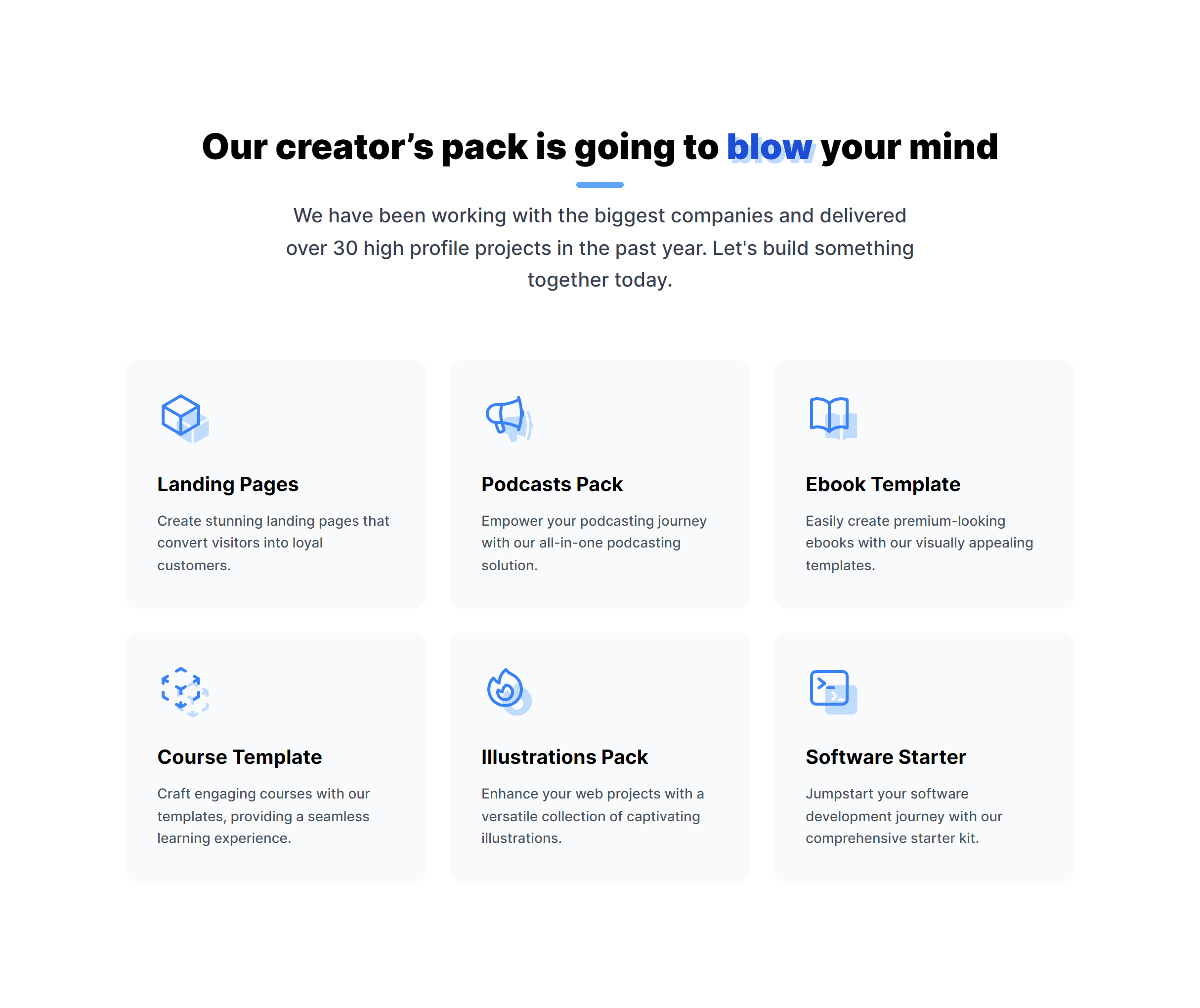
Secondary Features List
Boxes with Gradient
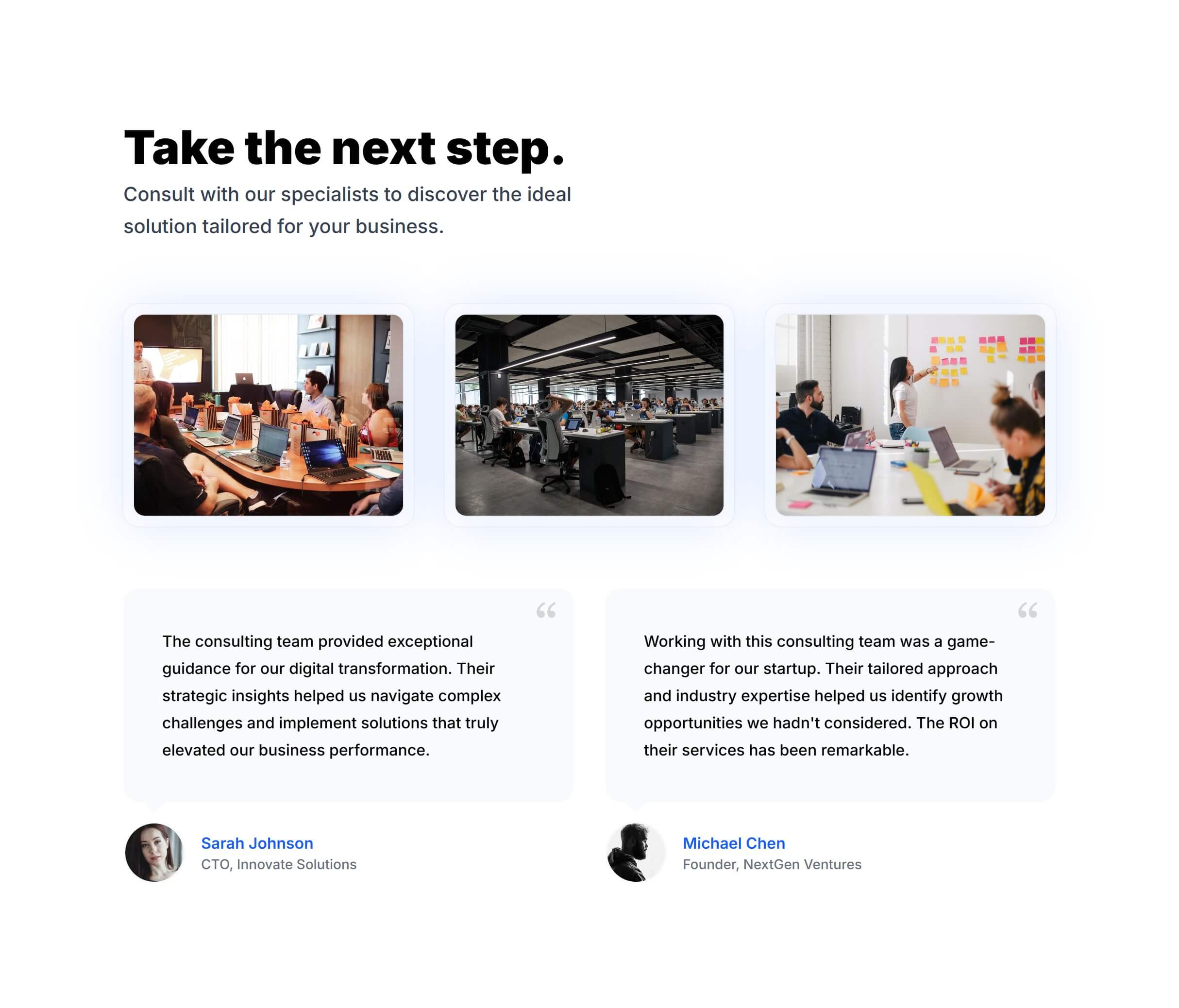
With Images and Testimonials
Frequently Asked Questions
Let’s have a better look into Tailwind CSS Features.
What's the best way to present features on a landing page?
Lead with three to four top features in a grid right after your hero section for a quick overview. If you need depth, follow with alternating rows (image left, text right, then swap) that give each feature room to breathe. Write headlines that focus on benefits ("Save 10 hours a week") rather than capabilities ("Automated reports").
How do I choose icons for feature items?
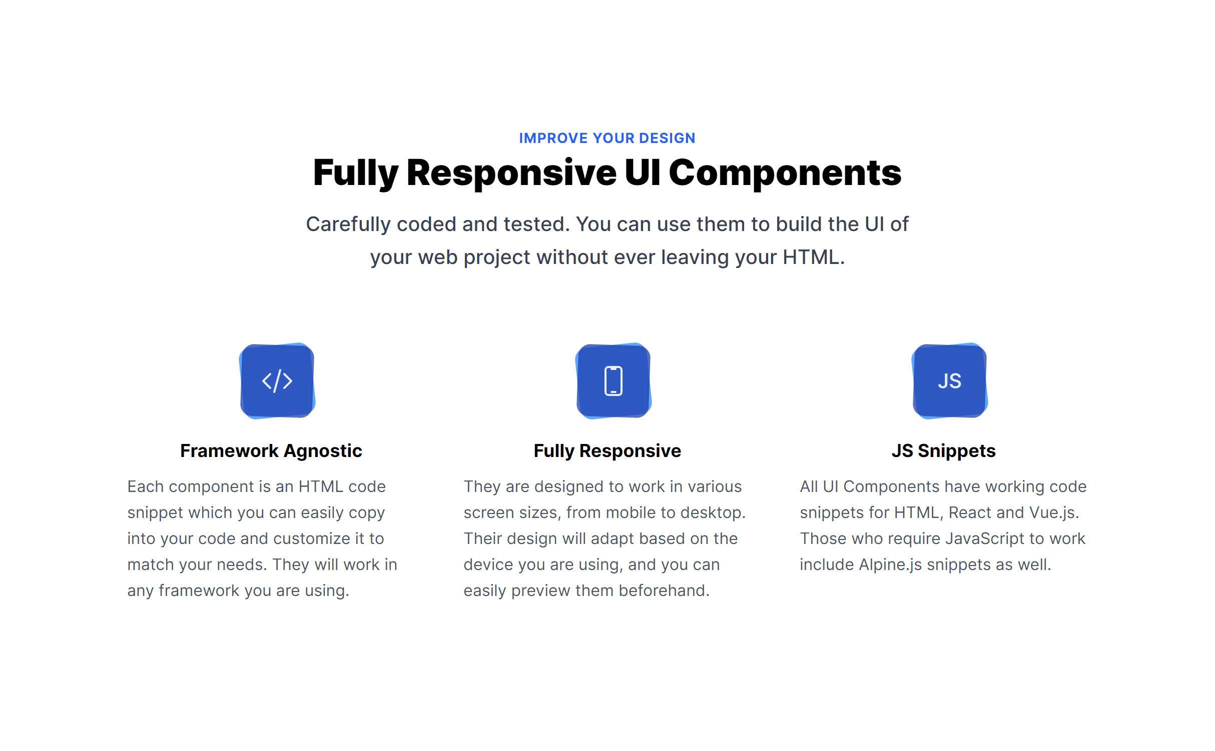
Use a consistent icon set throughout your feature section. Heroicons, Phosphor Icons, and Lucide work well with Tailwind CSS. Pick icons that clearly represent each feature's concept. If nothing fits perfectly, abstract geometric shapes work better than forced metaphors. Keep all icons at the same size and visual weight for a polished result.
Should I use screenshots or illustrations for feature visuals?
Screenshots build more trust for software products because they show exactly what users will get. Illustrations work better for abstract concepts or when you want a lighter aesthetic. The alternating-row variants are specifically designed for pairing text with visuals of either type. You can mix both approaches on the same page if it serves the content.
2,000+ handcrafted snippets.
Now in your AI editor.
Build modern web apps and websites with Tailkit's huge collection of Tailwind components, templates and tools. Now available through our MCP Server.